
A punch above: Malvern Residence
The modest nature of the original house allowed an elegant but playful aesthetic to unfold freely in the interior.
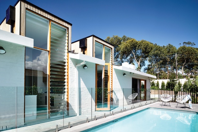
The existing pool is at the centre of the main garden, with an outdoor room organized at either end.
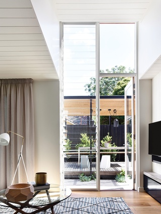
Tall and narrow glazed boxes in the north face let dramatic punches of daylight into the open-plan living space.
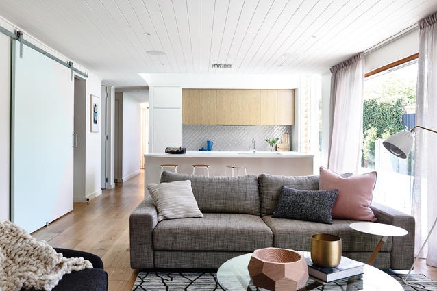
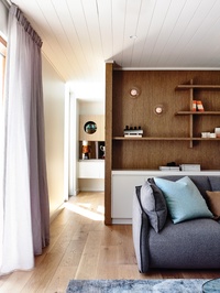
Thoughtfully customized joinery, while modest in scale, gives the living spaces an understated grandeur.
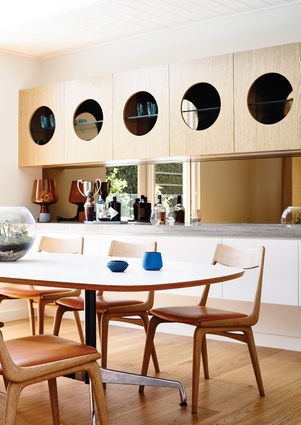
A circular motif is repeated throughout the house, including in the dining room joinery and the bathroom mirrors.
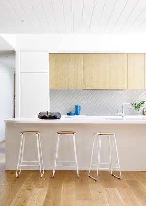
A bright palette of crisp whites and whitewashed oak gives the kitchen a luminous look.
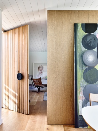
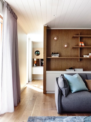
The interior proudly retains original features such as the panelled ceiling, mirrored here in the new timber-panelled front door. Artwork: Petrina Hicks.
A collaboration between Nixon Tulloch Fortey, Doherty Design Studio and Ben Scott Garden Design gives a modest 1970s brick house in Melbourne a renewed, quiet confidence.
The Malvern Residence sits low and unassuming on its streetscape. The roof line of the sunken, single-storey house just peers over its front fence. Keen to retain this modest roof line and minimal street presence, the clients commissioned architecture practice Nixon Tulloch Fortey to adapt their original 1970s brick house to suit the family’s changing needs. The challenge was to provide additional bedrooms and improve the quality of the existing spaces, all while remaining respectful toward the original architecture and strengthening the connection to the garden.
The architectural additions are light but clever interventions. The new bedrooms have been added to the east and south corners, tucked into previously unused pockets of the site. Due to the density of the site, there are no long-range views of the timber-clad additions. They are not seen from the central garden or the main living space. Other than the new garage door, the addition discreetly slips in at the rear of the house, apparent only to its inhabitants.
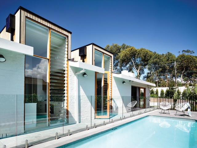
The main open-plan living and kitchen spaces remain in the original location beside the north-facing garden, as was the clients’ wish. However, with only 2.4-metre-high ceilings, the architects wanted to introduce volume, air and light to the space without destroying the sentiment of the original house. They widened the existing north-facing openings, but were keen to push further. By splicing three tall and narrow glazed boxes into the north face, they were able to drive dramatic punches of daylight into the open-plan space. Though powerful in altering the quality of the interior, these insertions are surprisingly inconspicuous. Internally, the line of the existing ceiling still reads strongly. Externally, the glazed boxes sit flush with the existing north facade, resulting in minimal interruption to the existing roof and building form. The glazed boxes only really become apparent when standing hard up at the opposite fence. The additions give generously but are ultimately unobtrusive.
Doherty Design Studio became involved later in the project, once the architecture had already been established. The discreet nature of the architectural additions and the modest nature of the original house allowed Doherty Design Studio’s distinctively elegant but playful aesthetic to unfold freely, without clashing with any overpowering architectural statement. However, the design response is certainly in line with the architect’s agenda to open up the home and introduce lightness. With a bright palette of crisp whites and whitewashed oak, the materiality aids the transformation of the formerly heavy, enclosed space into a lighter one. The interior also respects the original character of the house. Original features such as the panelled ceiling and existing brick fireplace have been retained. The period of the existing home also influenced some of the additions, such as the mosaic hexagonal tiles, the use of a circular motif and the inclusion of modernist furniture pieces. Although modest in scale, the thoughtfully customized joinery gives the space an understated grandeur.
Ben Scott may have been the last to join the design team but he was entrusted with the hero of the project – the garden. It’s clear that Ben has drawn heavily from the original period of the house, and perhaps a decade or two earlier. There are elements that definitely ring of mid-century Palm Springs. The pre-existing single-storey house with a low-slung roof, and a pool and garden at its middle, already set the tone for this. The crazy paving that appears in the entry courtyard is the first hint of this aesthetic, which snakes through to the main garden. Using the original pool as the main garden’s centre, Ben organized an outdoor room at either end. The first is a covered pavilion with a barbecue. At the opposite end is a round depression in the earth encircled by continuous bench seating. A fire pit occupies its centre. This round submerged outdoor room is reminiscent of the conversation pits particular to the mid-to-late twentieth century.
The circle is a motif that was introduced to the interiors by Doherty Design Studio and it reappears throughout. It introduces itself in the front doorknob and then returns as round cut-outs in the dining room joinery, in the circular bathroom mirrors and in the rounded slot in the main bedhead. It reappears in the landscape and strengthens the consistency between the two spaces, facilitating the seamless integration. Together, Doherty Design Studio’s open-plan living space and Ben’s northern garden are at the centre of the house. Both are supported by clever and discreet architectural interventions, which strengthen the connection between house and garden like silent accomplices.
All three design teams have respectfully responded to one another and the existing house. The unified approach has resulted in a gracefully cohesive dwelling. Driven by the clients’ wish to honour the humble existing home, the alterations give the house a quiet but bright confidence.


