
Above the curve: Concord Apartment
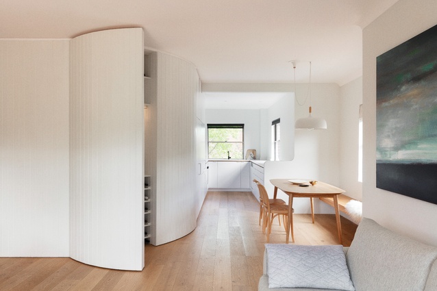
The insertion of a curved timber-panelled joinery wall defines the zones within the apartment, conceals original splayed walls and provides storage space.

Adequate access to natural light, with openings on two sides of the spaces, was taken advantage of in the design.
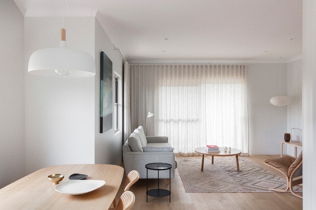
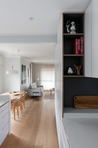
The entry hall leads around the curved joinery wall and into the living area. Artwork: James Turrell (prints).
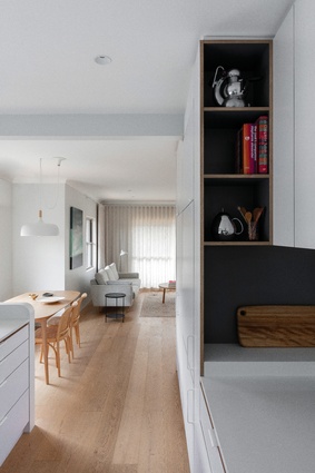
The kitchen is well connected to the other living spaces to foster everyday interactions.
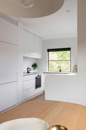
The convex and concave curves of the low wall between the dining nook and kitchen mimic the design of the main joinery wall.
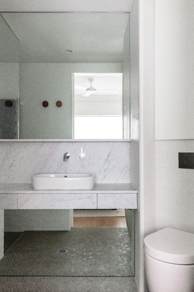
Parts of the bathroom walls have been built out in response to the original “awkward geometry.”
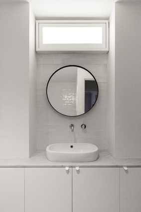
The lack of windows in the bathroom is countered with glossy tiles and mirrors that bounce light and an opaque light box.
This apartment renovation by Retallack Thompson overcomes spatial challenges and adds clever joinery elements, giving character and charm in refreshing the space.
Phillips Landing is a residential enclave on the banks of Sydney’s Parramatta River. Completed in 1996, it comprises fifteen two- to four-storey buildings that together accommodate 178 apartments. The owners of Concord Apartment purchased a three-bedroom, two-bathroom home in one of the buildings, off the plan as an investment property. Now nearly twenty years later their children have grown up and moved out of home, and the couple has retired, downsized and moved into the apartment themselves.
With some reservations about apartment living, the clients engaged architects Jemima Retallack and Mitchell Thompson, a husband-and-wife team who recently established their own practice, Retallack Thompson. They tasked the architects with making their apartment feel new, liveable and warm – to transform it from a mass-built investment property to an individual and comfortable home.

The apartment had good bones, with natural light on three sides of the living spaces and a balcony extending from the living room. But it also had concrete-block walls, cold-white paint, grey carpeting, stock-standard oyster lights and inboard bathrooms. “It was almost a process of denying what the actual unit type was – a 1990s sterile space – to consider how we could make it a home,” Jemima says.
Mitchell explains that the apartment presented some spatial challenges. He says the interior walls had forty-five-degree angles that provided more floor space but blurred functional areas, the kitchen was unnecessarily enclosed, the main bedroom opened straight out to the living area, the sofa had a view to the front door and there was limited storage space.
Wanting to provide a sense of rooms or defined spaces, Jemima and Mitchell designed one grand gesture in the form of a curved wall of timber-panelled joinery. Integral to the architecture of the apartment, the joinery wall curves as the spaces transition from entry hall to living space, dining area and kitchen. It also conceals the original splayed walls and provides storage space in between. “We took away space to make the sequence of rooms more logical, but in taking it away we’ve smoothed over the uncomfortable wall geometry and provided more storage space,” Mitchell says.
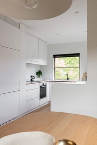
The depth of the refrigerator set the line for the curvature of the wall and led to a more integrated kitchen that is better connected to the other living spaces to foster and facilitate everyday interactions. The kitchen opens to the adjacent dining area, which has a bench seat to efficiently use the narrow space and allow for easier passage, and it has a line of sight through to the sofa in the living area.
This ease of flow and openness between spaces is the result of Jemima and Mitchell’s understanding of how their clients interact. The design also takes advantage of the apartment’s original architecture, which has windows on two kitchen walls and behind the dining nook and sofa, as well as a sliding-glass door in the living area. Having natural light on two sides of every room – “Pattern number 159,” Mitchell recalls, referring to Christopher Alexander’s A Pattern Language – is conducive to creating a good atmosphere, cross-ventilation and reducing the need for artificial light.
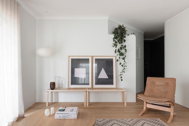
To soften the concrete-block walls and create a greater sense of tactility, the design of the joinery wall is mimicked in other architectural additions to the home, including the convex and concave curves of the low wall between the dining nook and kitchen, and the three-quarter wall that effectively closes off the main bedroom from the living area to provide privacy and defined space. The ceiling cornices and kitchen drawer pulls also speak the same language, as do the curtain rail and pendant lights.
The three-quarter wall not only provides privacy but also helps to physically delineate the living area and entryway, creating a hallway, or place of transition, in the process. The effect is reinforced by the dark paint on the front door and vestibule wall, which makes them visually recede. “We really like that we could make a hallway. It’s a little thing, but whenever you pass through your hallway from outside to inside you transition into being at home,” Jemima explains. “Pattern language 112,” says Mitchell.
The awkward geometry of the original bathrooms has been addressed by building out parts of the wall and adding much-needed baffling. The lack of windows is countered with glossy tiles and mirrors that bounce light and an opaque light box that creates the sense of there being a window.
This project highlights the skill of the architects in overcoming spatial challenges and designing in response to the clients’ interactions and needs. It also demonstrates the great potential of transforming a “sterile” mass-built apartment into a customized, atmospheric and liveable home.
This article was first published in ArchitectureAU.com.


