
Alpine comforts: QT Queenstown Hotel
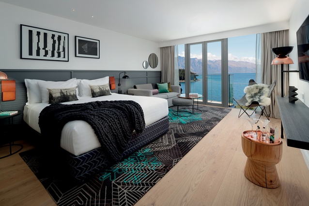
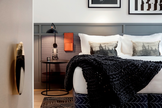
Round surfaces abound in the rooms of the QT Hotel while bold carpets separate sleeping area from the larger floor space.
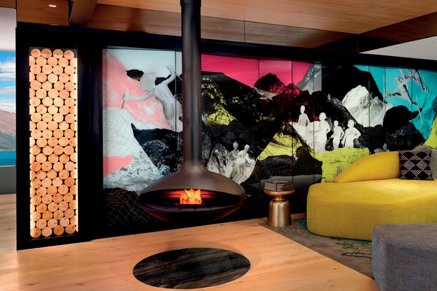
A small reception area with graphic focal wall alluding to the region.
The hotel accomplishes a very Queenstown sense of place.
An essentially cool colour scheme in the rooms is balanced by lush and soft textiles.

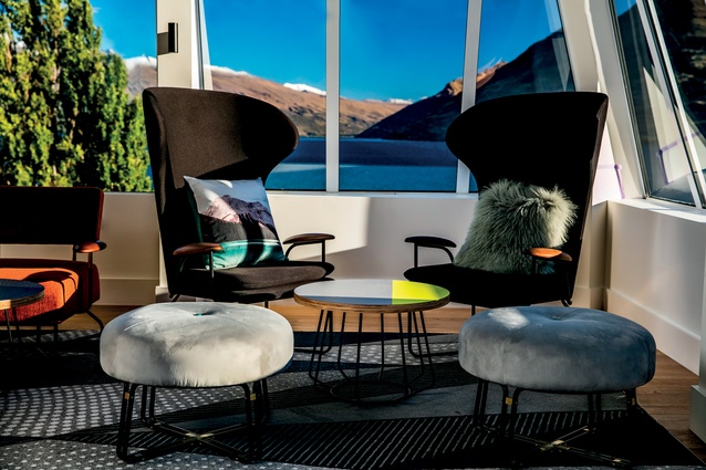
Circulation, presentation and the division of quiet and loud spaces make common spaces work for a variety of end users.
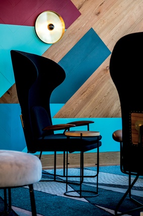
Sporadic pops of leather, wood and brass become focal amongst the darker palette.
Inside the QT, there are textures that allude to the classic ski lodge: soft, lavish upholstery, fluffy natural fibers and plenty of wood and brass.

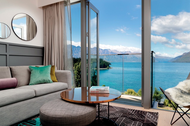
Views from the QT Hotel were partly responsible for its interior’s colour scheme and some of its embellishments.

Brass and wood details are a staple of the hotel’s design.
Reflective surfaces are a common theme throughout the hotel.
The hotel creates a few unique experiences and a sense of community and buzz within its impressive social spaces.

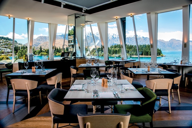
In the bar and restaurant, Australian designer Nic Graham sought something that didn’t compete with the postcard-ready sights but still instilled comfort and wow.
Bright colour, tiles and regular visual references to the hotel’s alpine location are commonplace in the social areas.
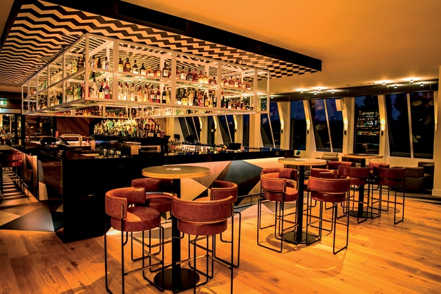
Reds Bar and the restaurant Bazaar are the heart of the hotel.
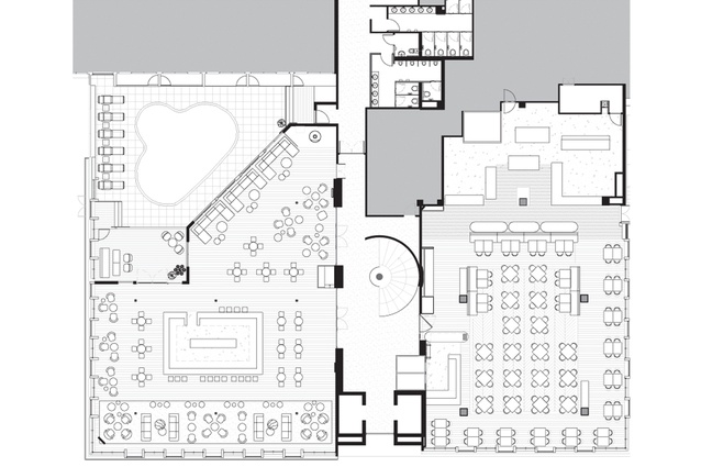
Bar and restaurant plan.
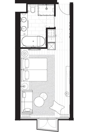
Typical lake view king room plan.
Federico Monsalve explores the QT Hotel in Queenstown and discovers a colourful and engaging space.
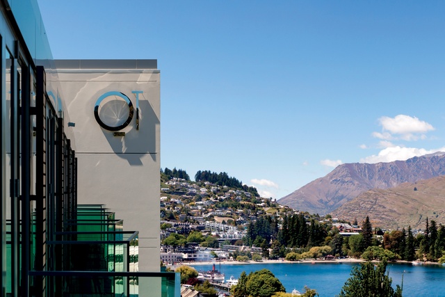
QT Hotel’s main entrance is on a pencil thin, hill-perched street that runs parallel to the western end of Queenstown’s famous Lake Esplanade. As a site, it makes complete sense: direct, unobstructed views of Lake Wakatipu, the Remarkables and the city centre on the far end.
Reception area is a small space composed of a comfortable agglomeration of velvety seats beside a suspended, black chimney. There is a graphic treatment on the main wall: colourful and slightly boastful of the region’s adrenaline-filled reputation. It is cosy with a dash of ‘jet-setting cool’ and this panache is further driven home by sharp, black hotel uniforms and a palette of black and concrete on the reception counter. Sunlight is moody and filtered, counter height is strategically low making you feel welcome.

Yet, that is it on this floor. Arrival is unceremonious and small and although it serves as a prelude to the material and colour scheme further in the building, it doesn’t exactly invite lounging in the way QT Sydney or Wellington do, or how Ace Hotels in the United States or Canberra’s Hotel Hotel accomplish loitering with flair.
One of the options past this space is to go down a level where a hall serves as a footbridge into Reds Bar and the hotel’s restaurant (Bazaar Interactive Marketplace), the key social hubs shared by QT and the adjacent Rydges Hotel.
Both bar and restaurant have excellent views and Australian designer Nic Graham (best known for a myriad of W Hotels worldwide) sought something that didn’t compete with the postcard-ready sights but still instilled an interior with comfort and wow. According to Graham: You could have put white bean bags on the floor and left the space white and it still would have worked… “you don’t need to do much!”.
During one of his early site visits on a particularly picturesque spring, Graham chanced upon the colour scheme as dictated to him by the serrated views. “They’d had a snowfall. All of the mountains were capped and had green and yellow wild flowers which met the blues of the sky and the lake,” says the designer.
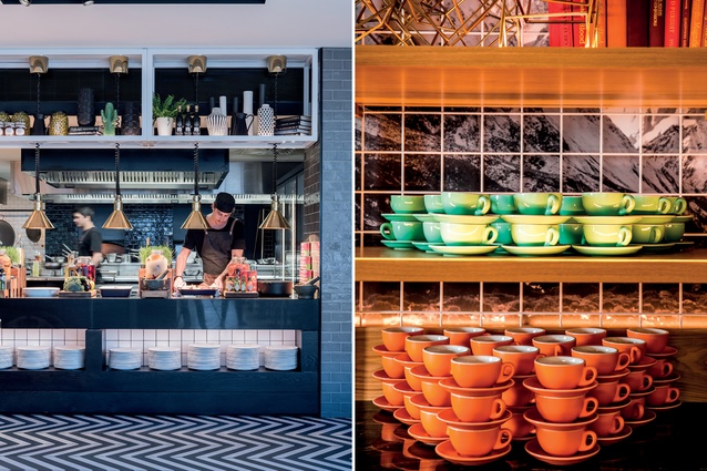
This colouration was carried throughout the interior of the bar appearing in seemingly random geometric patterns with loose allusions to the alpine surrounds: carpets with sharp, peak-like motifs dotted with patterns that could be snowflakes, ski tracks, and the like. There are textures that allude to the classic ski lodge: soft, lavish upholstery, fluffy natural fibres and plenty of wood and brass.
Those last two materials are, in a way, the most successful tokens in this space. Their proximity to the food preparation area lends an inherent warmth and residential feel to the restaurant. Add to this open fires from the kitchens, well presented produce, small glass jars, sizeable chopping boards for presentation, plenty of colourful tiles and the interior recipe here continues to charm.
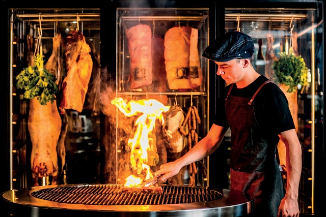
In terms of circulation and layout: Bazaar was devised as a series of stations, each with an open kitchen and a corresponding chef, each serving a different type of food. During dinner, for example, a station might focus on salads, another on seafood, while meats might grace another with two further un-manned buffet and dessert stations.
This was done, in part, to avoid straight queues. “It was something that started at QT on the Gold Coast and since then, when we have the space we want to make it feel like a kitchen zone where food is service a la minute. It is about maintaining freshness of produce and it is a nice engagement with the kitchen where you can hear the food sizzling,” says Graham.
This compartmentalised approach to the typical buffet has meant two things: quicker and more personalised service and the creation of a busy, energetic hub without the queues forcing punters to move quickly out of the way of the oncoming peak hour masses. So what the restaurant achieves in terms of hustle and vibrancy in the kitchen/self-serving area it brings down a notch in the seating areas which are created to take in the views.
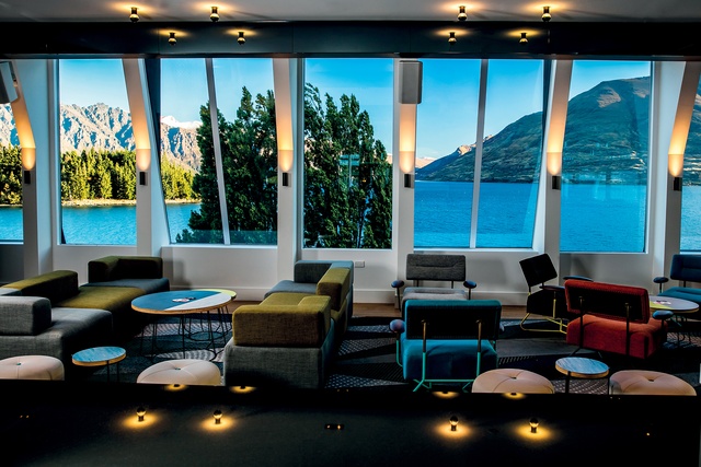
Reds Bar, on the other hand, is playful in nature with the sharp sloping windows dictating some of the similarly angular patterns on carpets and a simple, yet captivating abstract mural on a feature timber wall. The strong rectangular bar is in the middle of the room with plenty of socialising space all around it. This island style is similar to the hotel’s Sydney iteration and a move Graham describes as being in keeping with its brand: “flirty and sexy” and allowing punters clear sightlines to other patrons from across the entire bar.
Halls and connecting spaces in the upper, room levels are mildly alpine: stark white walls with grey peak motifs, round mirrors (reflective surfaces are a common theme throughout the hotel) emulating some sort of full moon, bright yellow signage in the subtle shape of a gondola, and a heavily patterned carpet that sets the tone for what is to come inside the rooms.

“We dropped a bomb on the carpet to make sure it is grand rather than beige,” says Graham, “in terms of overall embellishments it was a bit more skateboarder, board rider enthusiast while balancing that out with wine lovers and slightly older people looking for retreat and lake views.”
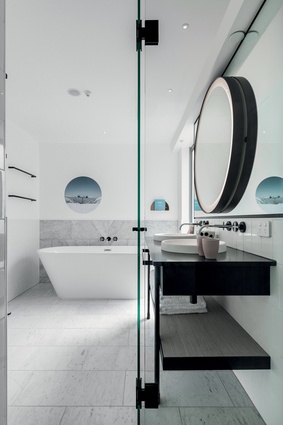
Yes, there is a bit of cost engineering going on in some aspects of the room: i.e the closet is laminated in a decal pretending to be a textile rather than on a textile itself; even though the view is jaw dropping QT didn’t bring one of their signature moves to Queenstown: bathrooms with sliding windows into the room and the lake outside.
Nonetheless, the hotel accomplishes a very Queenstown sense of place, it creates a few unique experiences and a sense of community and buzz within its impressive social spaces.


