
Balancing old and new: Crew HQ
The Crew headquarters in Montréal by Henri Cleinge’s studio has a hybrid programme, mixing a co-working office space and a café.
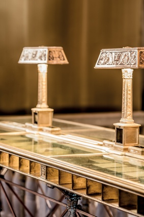
Solid-brass fixtures and neoclassical lights ensure the elegance and class of the original building remains.
The new additions to the interior complement the tones of the existing design, but are overtly contemporary.

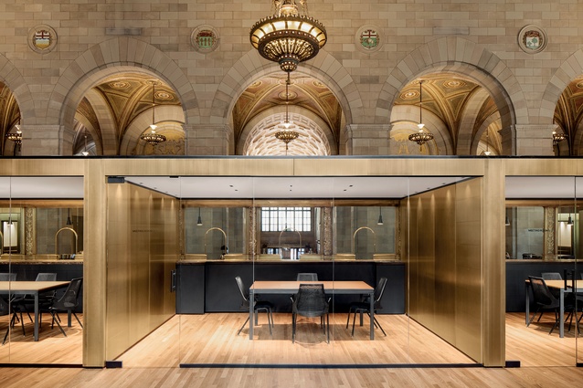
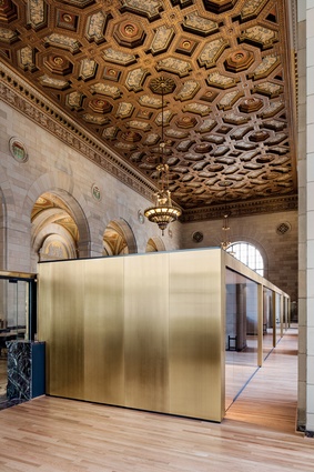
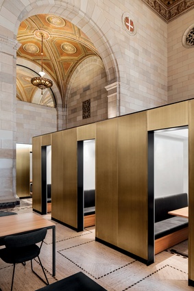
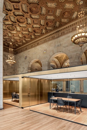
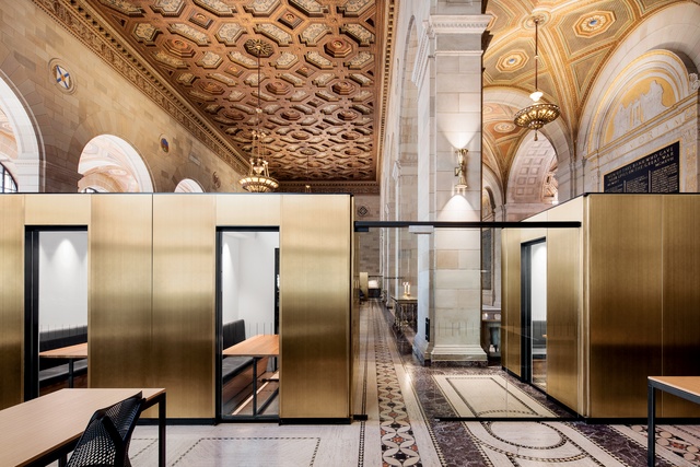
The meeting room boxes are crisply detailed and clad with brass-plated steel sheets.
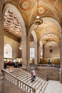
The building boasts an opulent stucco ceiling, copious solid-brass fixtures and enormous arched windows.
“The project ties the contemporary office identity into the existing space, creating a balance between the old and new.”
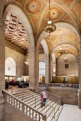
The building was originally designed for Royal Bank in 1926.
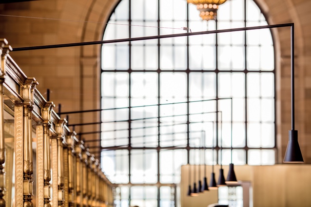
Large arched windows bring in plenty of natural light.
Smaller framed boxes provide quiet interior spaces for private meetings and more intimate work spaces.
In Montréal, a co-working office space and hospitality venue, deep within the shell of a heritage bank, receive a stunning and somewhat disruptive interior treatment, writes Sarosh Mulla.
Some might say it’s hard to go wrong when you are designing an interior that is already beautiful, and that is true to an extent. But to produce really spectacular results in such a space is actually terribly difficult. It requires a lightness of touch and a precision in design that isn’t easily or commonly found.

Henri Cleinge’s firm has carried out one such project in the design of the new Crew interior in Montréal. Crew is a young innovative tech start-up, and naturally, had a suitably disruptive view of what their headquarters should be when they approached Cleinge.
The project has a hybrid programme based around co-working office space and hospitality, all set in a neoclassical bank building. The idea behind the combined programme is that the Crew space was not only an office but also a public amenity and an attractor for other tech start-ups. So the space needed to accommodate permanent offices, temporary leased spaces and the transitory movement of café patrons.
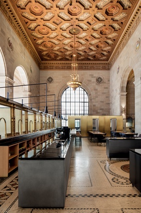
The existing building was originally designed for Royal Bank in 1926 and boasts an opulent stucco ceiling, copious solid-brass fixtures and enormous arched windows. The space is undoubtedly powerful in its own right and has a honeyed hue as the light bounces off its many gilt surfaces onto the warm sandstone walls and cream marble floor.
It’s easy to imagine the original design demonstrating the success and stability of the bank before the Great Depression struck in 1929. The building’s current owner respects the original fabric of the structure and was a strong advocate for a sensitive renovation of the interior.
The Cleinge team had to deliver a clearly articulated plan within the space in order to make sense of the different programmatic zones. Cleinge notes, “The mixed programme was defined architecturally through the translucency between zones.” Consideration of sight lines and glass panels enable this translucency.
The bank’s teller stands, which are located in the centre of the space, were used as a buffer between the public and private areas. The beautiful but challenging obstruction was used in this way to create a clear demarcation between the office spaces and the café seating. Behind the teller stands, a new bar is introduced for the café. Post-tensioned steel light fixtures cantilever from the teller stands over the bar, providing a delicate and contemporary lighting solution.
Cleinge also had to contend with the lack of acoustic dampening in the space and the impossibility of hanging new lighting from the protected and ornate existing ceiling. The marble floor also posed problems and floor-mounted power outlets had to be precisely positioned. Cleinge describes these challenges as “negotiating with the existing structure”.
A more apt description of designing within heritage structures has scarcely been made. Key to the Cleinge strategy is the use of smaller framed boxes, which provide quiet interior spaces for private meetings and more intimate work spaces, while also breaking down the large floor plate into smaller volumes. These boxes are crisply detailed and clad with brass-plated steel sheets.
The brass surface is brushed and sealed with a coating to avoid fingerprinting and discolouration. These surfaces complement the tones of the existing interior, but are overtly contemporary.
This demonstrates the philosophical stance of Cleinge in terms of working within heritage structures. The new portions of the project should look, well, new. There should be no historic reproduction, but instead a contrast formed between the old and new that brings out the best in both. “The project ties the contemporary office identity into the existing space, creating a balance between the old and new.” It’s a delicate and thoroughly satisfying balance in this case.


