Beyond the lava lamp
Global attitudes towards cannabis are changing rapidly. In the process, many nations are having to invent design-driven retail experiences to replace those previously defined by illegality and secrecy. As New Zealand starts to discuss the drug’s future, Simon Bush-King checks out the design requirements of two cannabis retailers, one in Portland and one in Amsterdam.
Right now, New Zealand is discussing legislation which, if passed, would allow the production and dispensing of medicinal cannabis. If the USA is anything to go by, that could be the gateway legislation towards decriminalisation and the brick-and-mortar retailing of marijuana. Consensus over contentious issues is usually hard fought – until recently the issue of cannabis has been no exception – however, divisions that enforced the status quo are breaking down.
Evidence-based health policy is becoming widespread on both sides of the political aisle; meanwhile, examples from overseas of legalisation and decriminalisation continue to filter back home. As this formerly illegal industry looks to move in from the cold, it will, potentially, have an impact on health services, tax revenue, criminal justice and employment; aside from this, what role will design play?
The story of the legalisation of cannabis and design is one of a sellers’ market transitioning to a buyers’ market, as a legal industry is created almost from scratch. From a quick scan across the globe, two varying directions from one location – namely the states in the USA where pot has become legal – stand out.
First is witnessing how a design and aesthetic language is being created to service the fledgling industry and, secondly, is observing how a designed customer experience (one that goes beyond sneakers hanging from a telephone line and sketchy living rooms) is being forged for the first time.
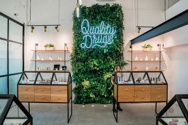
It is perhaps, no surprise that, of the 26 countries where pot is either legal or decriminalised, it is in the USA where design is having some of the biggest impact. As the country is the spiritual home of capitalism, the cannabis industry there is poised to be worth $25 billion by 2025.
With such inducements, a cohort of professionals and entrepreneurs is forging the way to clean and redefine the design persona of the industry. Jeremy Pelley, the head of Portland multidisciplinary agency OMFGCO, has been involved in a number of cannabis-related architectural projects and is clear from the outset: “I want to elevate what it means to buy cannabis”.
This is a surprising sentiment perhaps, considering Pelley, his collaborator designer Holly Freres from JHL Design and their clients all come from more-traditional business backgrounds. The client is a family-run developer company based in Portland, Oregon; meanwhile, OMFGCO and JHL are more used to working for traditional lifestyle and hospitality brands. They drew heavily from this background when developing a direction for two new cannabis brands.
The client and project team were clear from the outset in establishing two very distinct brands: an A brand (Serra) to locate cannabis firmly at the top of the retail market and a B brand (Electric Lettuce) as a more accessible brand but with the same rigour towards marketing and design.
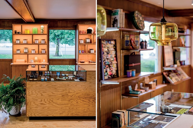
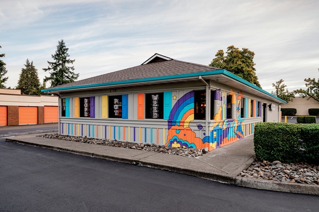
Like all good business owners OMFGCO knew that removing customer barriers grows a market and leaves punters coming back. As Pelley explains it, they knew about the need to be empathetic with an audience. For all these new people who are returning to it after not smoking for a long time or people who have never tried it – we wanted to break all the tropes.” By ‘tropes’ he means the head shop or dank hippie dens most often associated with the drug.
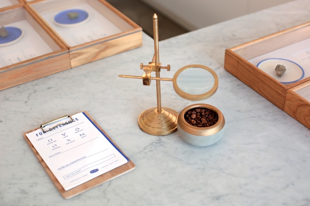
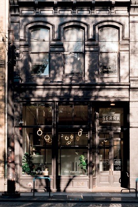
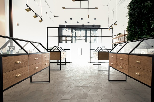
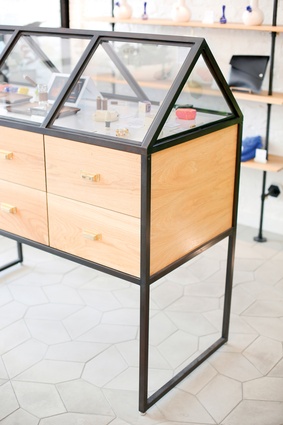
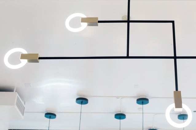
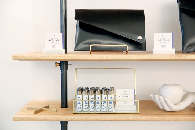
At Serra, which is located in downtown Portland in a renovated shop front, the timber-and-black steel display cases, geometric cement tile floors and green wall, all locate this shop squarely in the language of high-end retail. Freres confirms: “We didn’t want to be too stonery.”
Even the tagline on the front window, ‘Feel all the Feelings’, may carry a sentiment that could easily be illustrated in rainbow, hand-drawn letters on a tie-dyed backdrop but, instead, it is embossed in tight, gold lettering across the black-gloss 19th-century façade.
Freres and Pelley are up front about the intention to incorporate aesthetics that work well in the hospitality world, while approaching the merchandise as they would for a high-end retail store. Freres says: “It’s like the fancy shoe store. It has a curated selection, and people are curious about the beautiful store that sells cannabis”.

Pelley, Freres and their clients also show what may be design’s biggest potential in this fledgling industry: a designed customer experience. It starts with a brand segmentation to attract different market types and is followed by the creation of customised, interiors-driven customer experiences in each store.
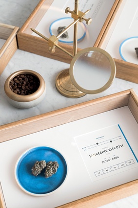
Rather than highlight the security requirements of the store (customers are not allowed to physically interact with the product), they, instead, match each guest with a staff member at the point of entry. This solves, in a subtle but effective way, security issues while also giving each customer a highly personalised service. The waiting area in the front of the store is light and open with no window bars or pawnshop cages to be seen.

Then there is also a question of education. Cognisant of the fact that most people wouldn’t know an ‘indica’ from a ‘sativa’ (the two major types of cannabis plant), they grouped the product based on six ‘feelings’: understanding that if nothing else, people know what experience they want from the product. This approach is reinforced in store-placement and graphic design, where each of the six feelings is reflected in branding and typography.
Across the Atlantic, Amsterdam is perhaps the best-known weed-friendly city in the world. The Dutch are known as consensus builders after centuries of having to cooperate to keep the water and, for that matter, the French, German, Spanish and British out. However, one of the downsides of the consensus ‘polder model’ (as it is known) can be a tendency towards an attitude of ‘if it isn’t broken, don’t fix it’.
Dutch coffeeshops have tended to reflect this attitude and have remained largely unchanged in operation and aesthetic since they began in the 1970s and 1980s. Coupled with this is a general sellers-market attitude where customers are plentiful and, at least with most tourists, used to illegal purchases, therefore, any legal customer experience seems like a step up.
However, in Amsterdam, too, things are beginning to change. For many reasons, the government has forced many coffeeshops to close to the point where the number of renowned cannabis dens has halved since 1995; the result has been some consolidation in the market by fewer players. Add to this a more-connected global cannabis industry where experiences from more consumer-focused places like the USA filter back.
Boerejongens Coffeeshop (which translates to ‘farmer boys’) is pointing in a new direction. Like its American counterparts, it is aware of the typical coffeeshop experience and aims higher for its customers. Instead of heavy-handed bouncers, it employs suited and booted doormen with a brief to help, not only customers but the coffeeshop’s neighbours as well.
This, in itself is an important consideration, given that the local authorities’ attitudes to individual coffeeshops are heavily tainted by the ways in which they manage their relationships within their neighbourhoods. At Boerejongens, they also borrow a very specific design language – this time, that of the pharmacy. The dispensary is dominated by a counter and point of sale area, which reflects a chemist and where the dealers wear white coats.
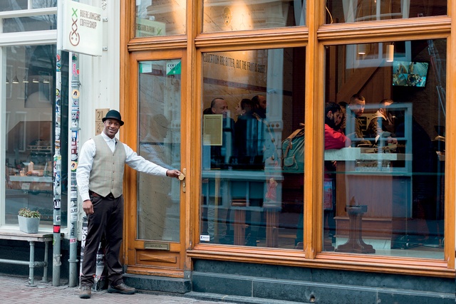
It is unclear on which side the cannabis coin will land in New Zealand. However, with so much potential investment on the table for both the government coffers and likely entrepreneurs, coupled with what is likely to be the most pot-friendly government ever, one would be unwise to bet against a more-relaxed attitude towards the herb in the future.
While, as designers, we can only hope the transition occurs in a clear way that mitigates any negatives while embracing the opportunities, it is an industry with a lot of potential. It has a customer base driven by experience, altered mind sets and ready cash. A maturing market will see only further use of design as the phase of borrowing aesthetics gives way to design as a means of differentiation.
Places designed around socialising with alcohol dominate the hospitality industry and are so ingrained in our shared history and lived experience it is hard to imagine how it would be to invent such a typology. The rituals and aesthetics of our bars, restaurants and cafés have been built up over centuries.
To witness the creation of spaces for the legal sale and consumption of an old vice will, if nothing else, be quite the trip.
This article first appeared in Interior magazine


