
High on a hill
Architect Gordon Moller taught himself how to counter Wellington’s steep sites and high winds by nestling houses into hills and banks.
From one of the courtyards the views stretch from Cook Strait into Wellington Harbour.
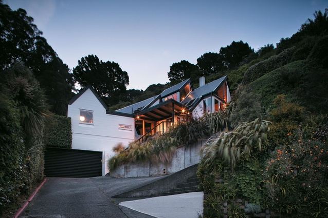
The Kimber’s Seatoun home from the road. Its roofline follows the shape of the slope it is built into.
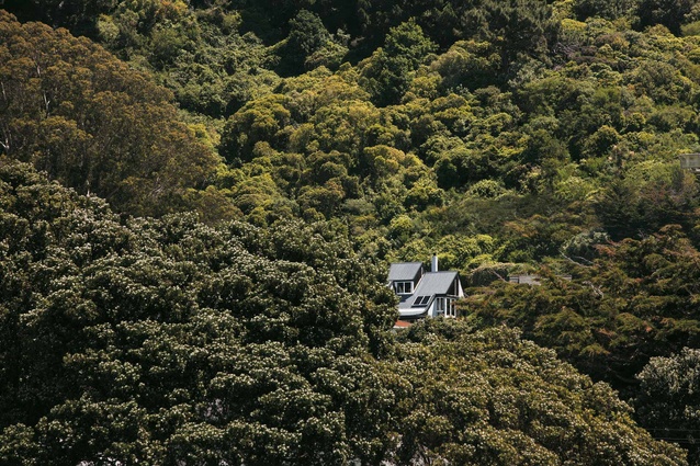
The 1975 dwelling nestles into the hill.
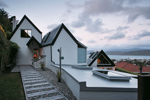
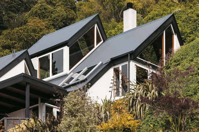
In classic Molelr style, the house has several roofs pitches and plenty of skylights.
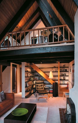
A mezzanine above the reading nook houses a drum kit owned by of the boys.
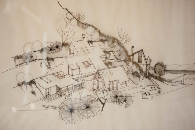
A drawing of the house by Gordon Moller of Moller Architects in Wellington.
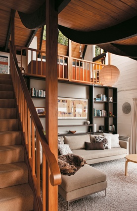
Owner Ainsley Kimber had the living room bookcases made at his furniture factory.
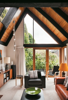
The ceiling beams are original and constructed from Douglas Fir.
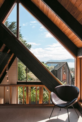
A mezzanine above the reading nook houses a drum kit owned by one of the boys.
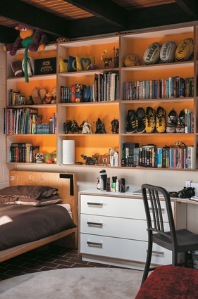
Future Ply bookcases custom made in the Thonet factory were installed in the boys’ bedrooms and painted yellow and orange, in keeping with the ‘70s aesthetic of the house.
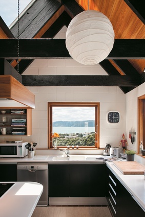
The kitchen window is part of the original architecture and showcases the views from the house of Wellington Harbour and across the bay to Eastbourne.
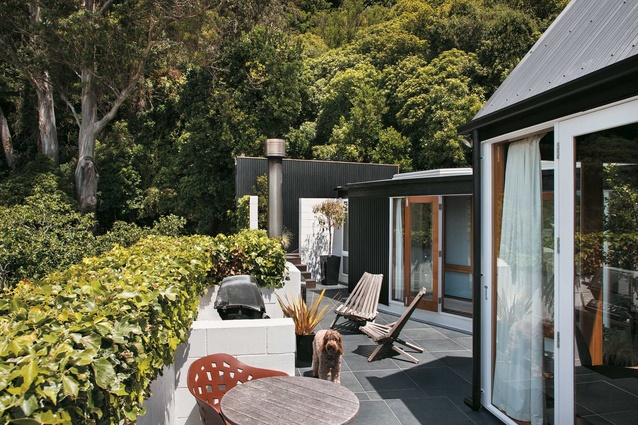
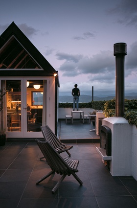
The courtyard is angled to make the most of the sun.
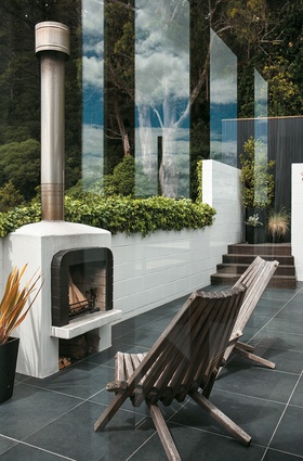
In a sheltered courtyard, an outdoor fireplace mirrors the lines of the home’s 1970s’ interior.
Gordon Moller once explained his practice of designing Wellington homes thus: “It’s view versus sun versus wind”. An expert in creating dwellings sensitive to the capital’s peculiar geography and elements, the renowned Wellington architect (and creator of Auckland’s Sky Tower) taught himself how to counter the city’s steep sites and high winds by nestling houses into hills and banks.
In 1975, he designed just such a house in the eastern suburb of Seatoun – and when it went on the market in 2005 Ainsley and Karen Kimber jumped at buying it. Then they set to bringing the home back to its original glory. “It was honest and raw: no GIB, just concrete,” says Ainsley. “These houses are cosy: full of nooks and crannies. They’re modernist, but they’ve still got a lot of warmth about them.”
Today the home is almost finished (just the master bedroom and ensuite are still in a 1970s’ state). It still feels like a haphazard series of adjoining geometric pods. The small rooms fit together like a child’s LEGO house – not cohesive and with no central hub. The architect designed it this way for a very good reason.
“Moller placed each room in this house on the angle which would get the most sun through the ceiling,” says Ainsley, co-founder of furniture company Thonet. “Skylights in every room ensure the house feels warm, bright and airy.”
Designed with multiple geometric angles, the house’s convoluted internal wall placement meant the Kimbers did not want to mess with its structure while renovating. “In our view, it was 80 per cent perfect when we bought it,” says Ainsley, noting classic Moller features such as interior wall windows. “The other 20 per cent just needed refreshing.”
Neville Parker of Inside Design worked with the couple, who have two sons, aged 16 and 21, living at home, to upgrade the interior of the house. The original joinery, which was tired and sagging, was replaced with simple Rimu frames and cedar doors. The concrete walls were painted white, rather than bright colours, in keeping with the original, 1970s’ style.
“Concrete and white don’t normally mean warm,” Ainsley says. “But after 40 or so test pots, I found Resene’s Quarter Spanish White. It had a crispness, but wasn’t cold or yellowed.” Custom-made bookcases, constructed from black-stained American Ash, were made at the Thonet factory, which produces mostly commercial custom-made furniture under brand name KMS, and now define the lower sitting area. “The bookcasing brings the ceiling down, so you feel like you’re in a cosy room, not a double-height open area,” says Karen. “It also complements the original Douglas Fir beams,” Ainsley adds, noting their curvature towards the mezzanine main living area.
Mid-century modern furniture from Thonet is scattered throughout both living spaces. “That’s the brilliant thing about owning a furniture company – you just bring stuff home,” says Ainsley, noting his favourite pieces: the Siesta 302 Classic Chair by Ingmar Relling and Alvar Aalto’s 406 Armchair. Organic in shape, the pieces flatter the house’s retro curves. In one of the living rooms, the original fireplace has been restored. A couple of 1970s’ ceramic lamps light it at night, alongside the original hanging globe-shaped light fixtures.
Back on the lower floor, the L-shaped kitchen has been refurbished in Rimu joinery, but the shape of the kitchen was unmodified to preserve “its best feature”, says Karen, pointing to the kitchen window. “Whether it’s a ship across the water or the lights of Seatoun, it’s the best view in Wellington; there’s something happening day and night.”
The “bunker” of a bathroom, as Ainsley calls it, sits opposite the kitchen, beside three small bedrooms. “The bathroom used to be yellow Formica,” Ainsley says. “It was bright and hideous.” Now, an inclined feature wall in imported Italian ceramic tile slopes up towards a hidden skylight: “It complements the concrete, and keeps the bunker feel, but turns it into something light and un-oppressive.”
Outside the dining area is a courtyard, around which newly planted hedging serves as balustrading. An outdoor fire, inspired by the indoor inglenook, is another nod to the 1970s. On another exterior level is a larger decked area with a path resembling a train track that “leads to nowhere”, says Ainsley. From this area, one can fully appreciate the individual geometric areas that make up the house. And the fact that it’s tucked away from the elements. “We can be reading inside and enjoying the last of the sun while the boys barbecue outside,” says Karen. “Because this house is on so many levels, everyone can have their own space.”


