
Houses revisited: Mission statement
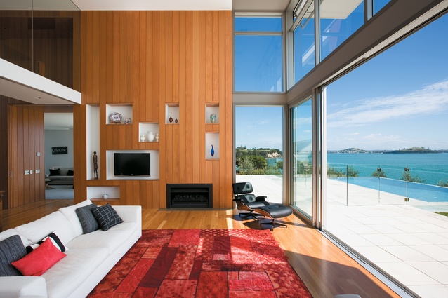
The house, with its cedar-clad interior, looks out to the Hauraki Gulf.
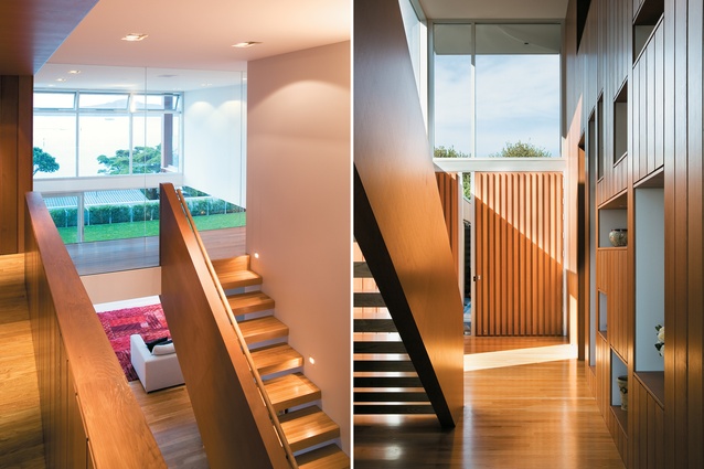
The stair landing makes a feature of the double-height space above the living area; Recessed cubby hole in the living area walls display family artefacts.

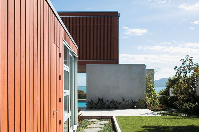
Textural materials were chosen to articulate the different areas of the house.

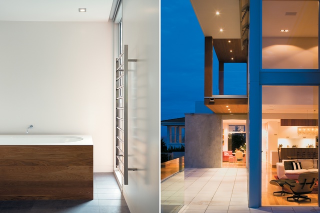
Considered combinations of materials in the bathroom give interest and warmth to this space; The dramatic overlapping and cantilevering of forms creates a rich seaward façade.
First published in 2008, Paul Clarke has designed a view house in Auckland’s eastern suburbs that preserves a little of the past.
Mission Bay is a salubrious suburb: sunny, affluent and generally thronging with an invading horde of inline skaters as soon as the climate becomes remotely temperate. It’s a destination suburb for some, appealing to those who live south of the Bridge, and no doubt to plenty of those who live north of it, but then there is Devonport and Takapuna for that mob.
Mission Bay is also a great place to live, particularly if you live above it. This house, designed by Paul Clarke of Crosson Clarke Carnachan Architects is well above it; hidden down a long driveway, the house sits, with its neighbours, on a minute promontory, a knuckle of land that punches gently into the Gulf. Walk down the drive and an interesting view reveals itself to the west: the abbreviated, disembodied robot heads of the towers of the CBD, rising above the crest of Takaparawha Regional Park.
Reach the house proper and the welcome is formal. In the style of many modern city houses, a closed face is presented: the garaging and a double-height concrete wall, soon to be covered with ficus, adjacent an oversized cedar door. However, there’s no fence, which is charming, and economical, as the bulk of the house and garage fulfills a delineating role. Here also is a first suggestion, as Clarke mentions, of the ideas of Piet Mondrian as study for the design: “A canvas subdivided into rectangles by horizontal and vertical lines, and coloured using a very limited palette”.
But this side of the house isn’t where the action is. It’s the front door, but it’s not the front of the house. If you could say the house had eyes, then they wouldn’t be here; they’d be on the other side, staring at Rangitoto, and from this elevated position there’s plenty of it to ogle.
The major decision, says Clarke, was whether to tear down the existing structure or start from scratch. The immediate preference was toward remodeling the original house, in which the family’s children had for a time lived, but that option ultimately wasn’t viable. “We would have had to go a long way backwards to go a little forwards,” Clarke says.
Once the decision was made to start over Clarke searched for an idea to tie into the house. “We looked at the family’s history for a common theme,” he says. “The house evolved around the idea of printing and labeling and the history of the family, which had been in that industry since 1883, and a way in which to preserve that history.”
Memory is about being able to store, retain and retrieve information. Mementos are triggers that accentuate recall. At this house, Clarke and project architect Kit Lowe devised a cedar-clad central core, which starts just past the front door, and is fitted with a number of rectangular, recessed spaces that display artefacts from the family’s history. It pushes forward into a double-volume day room that contains kitchen, lounge and dining spaces. Here the view is truly epic. If you’re a fan of Rangitoto then here you can have almost all of it. Unfortunately, a ubiquitous TV aerial attached to the house in front somewhat gatecrashes the visual party, although once the existing planting matures that should be accounted for.
The problem, of course, is that big views across water bring big glare. The clients, says Clarke, were keen on having as much of the view as possible, and you can hardly blame them. But in winter, particularly, when the sun settles a bit lower, reflected beams bring an eye-socket-jangling, hard white light. Parachute-like curtain material is the solution here, with a number of segments allowing specific shading. Shutters don’t work when you need to max out the view, although operable louvres shade the patio in front of the more formal lounge adjacent, and recessed blinds offer protection in other rooms.
Spatially, the house’s delineation is simple: office, guest quarters, dayroom and lounge downstairs; accommodation up, accessed by a sturdy stair that lands at a glass-faced bridge that divides master bedroom and the rest of the rooms. The dayroom, the main living space, comprises a white Corian-topped kitchen and an adjacent dining area. In the same room is another space, differentiated by a slight change in ceiling height – a casual dining and seating zone, a place for more informal gatherings, where children can play, where you can make a mess and be visually isolated from the rest of the room.
In fact, much of what is good about this house comes from its layout, connections and partial connections between rooms that prolong views and extend the eye, yet without losing the intimacy of the immediate surroundings. The use of timber on the walls and floor also enhances the tonal qualities. In the oversize dayroom, for instance, there’s surprisingly little echo, and no acoustic panels were fitted.
The house that originally existed on the site influenced the selection of cedar as a cladding material. Elsewhere, the materials are contemporary – glass, precast concrete and anodised aluminium. The original house also influenced the level of the ground floor – Clarke and Lowe lugged a kitchen table to the site to test elevations – which projects outside across wide, tiled patios to a pool with infinity edge, thus providing a water-on-water effect. Large glass sliding doors allow for a continuous space from the back of the garage through to the front of the section, or for more intimate areas depending on the wind, an important consideration given the elevated position and prevailing winds.
The thing about this house is that there’s a place for everyone, at every time of day, inside and out. It feels like a new house, but it has built-in history. It’s warm, thanks to the cedar walls and oak flooring, but airy. Perhaps the best way to describe it is as a modern house with traditional mores.
Click here to see more Houses Revisited.
Note: Since the time of writing, the design practice featured may have changed name, personnel or both.


