
Lion
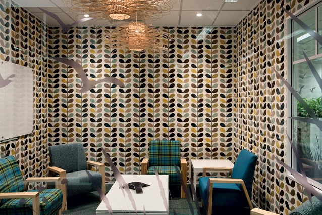
One of many meeting rooms with a clearly expressed personality to help navigation.
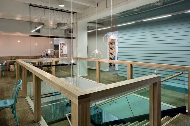
The connecting stair with café and kitchen on level two.
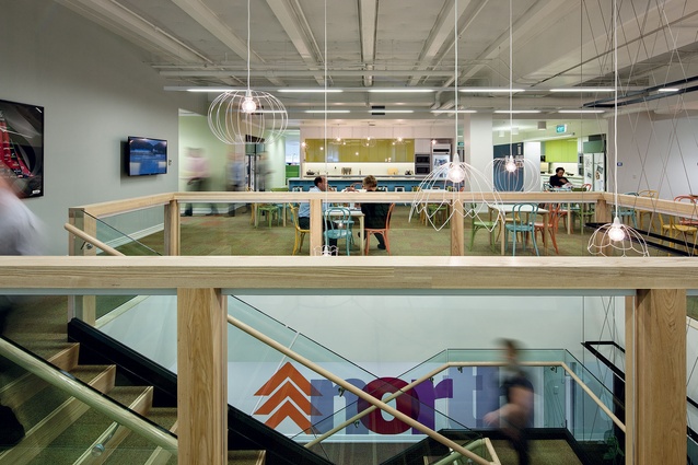
The connecting stair with café and kitchen on level two.
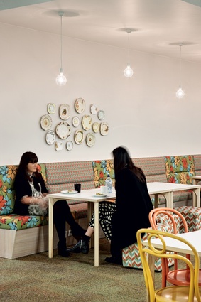
Colourful banquette seating in the café area.
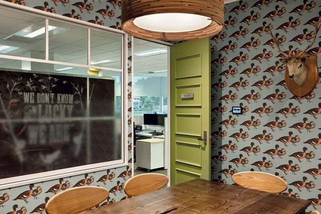
The ‘duck’ meeting room.
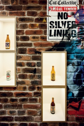
A display wall, with custom graffiti work.
A message from an advertising campaign from yesteryear.

Dinghies take pride of place in this setting and the nautical theme continues into an adjacent ‘lighthouse’ with buoy-referencing light fittings.
Dinghies take pride of place in this setting and the nautical theme continues into an adjacent ‘lighthouse’ with buoy-referencing light fittings.
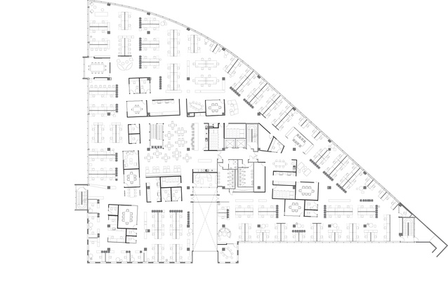
Level one floor plan.
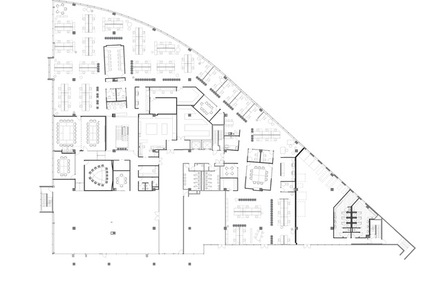
Ground level floor plan.
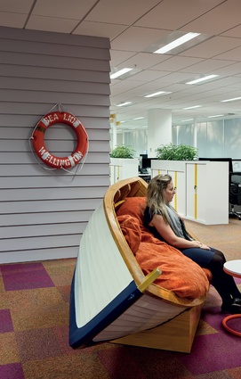
Dinghies take pride of place in this setting.
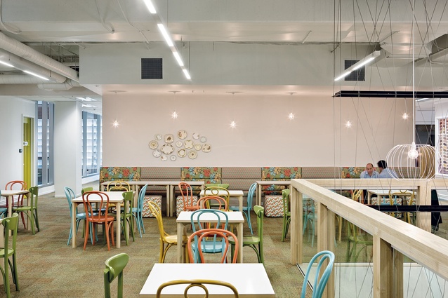
Colourful banquette seating in the café area.
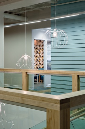
The connecting stair with café and kitchen on level two.
There can be an intrinsic tension when you get down to theming corporate office space. To paraphrase Andrew Tu’inukuafe, whose firm recently completed the fitout for Lion’s new head office it’s a bit of a tightrope walk between future flexibility, a sense of current place, not being bland, and creating something that isn’t going to date.
Of course, everything will date given time; a point made clear by one of the display walls at Lion’s new HQ in Freeman’s Bay, Auckland – a convincing faux brick wall that depicts variations in branding and packaging that the giant brewing company has undertaken over the past few years. The world of FMCG packaging design and marketing is, naturally, quite different from that of interior architecture. Trying to hang your interior hat on a current branding style will make for a design with a short shelf life.
Where then to look when developing themes? A derivative of ‘home’, or ‘geography’ perhaps? Both these ideas are not uncommon in corporate interior expression, but at Lion there seemed to be an opportunity for such ideas to be developed further. Despite 100 per cent ownership of Lion moving to Japanese hands in 2009, Lion is still generally perceived as a New Zealand company, with provincial ties that germinated in part from its heritage of regional breweries producing beers with strongly parochial followings. In 2010, Lion consolidated much of its brewing capacity into a new facility, The Pride, in Ormiston, with the company’s Newmarket brewery to Auckland University. While Lion had a 100-plus year history on this site, it had spent considerably less time at its Carlton Gore Road headquarters – 12 years. In this building it was spread across four floors with a large central core which wasn’t particularly suited for achieving the more modern type of working style a new building might offer. With its lease up, Lion began searching for new premises, which it eventually found in Freeman’s Bay, a mostly residential neighbourhood tucked away beside State Highway One. Lion took out a 10-year lease for 5,000m2 of the GHD Building, where its office is now spread across two floors that are triangular in shape.
Creative Spaces, says managing director, Wanley Simpson, won the Lion project via a tender process.
“From the start, one of the key things Lion was interested in was culture,” he says. “How the new office was going to progress their internal culture. A lot of our early discussions focused around the idea of culture and workplace change. They are a very people-focused organisation – in our conversations it was all about ‘our people’, not our staff.”
Simpson says that Lion had a good recent fitout experience in Sydney to draw upon as a precedent, and says that the firm wanted to do something exceptional in New Zealand. “Our pitch, really, was our people and our team – the cultural fit. It wasn’t a design tender, but a tender of credentials and fees and costs and service. One of main things that swung our appointment was, I think, that we had a better cultural fit.”
To research design concepts, Andrew Tu’inukuafe, the company’s director of interior design, travelled with designer Ella Rasmussen to Sydney, to inspect Lion’s new (much larger) head office. With that ticked off, they returned home to develop an overarching concept that keyed into the regional spread of Lion and the idea of ‘home’ that seemed to fit so well with the company’s ethos. At this stage, it should be mentioned that another firm undertook the front of house design work at the new premises – Burning Red, a fitout firm that undertakes a number of hospitality projects for Lion designed the “sociability” area, found on the ground floor adjacent to and behind reception. This area was loosely modelled on a typical Ponsonby villa.
Tu’inukuafe says they discussed with Lion “this idea of there being no place like home and of home in a couple of ways.”
“Coincidentally, the office is in a residential neighbourhood, but we also considered ‘home’ in the more general sense of New Zealand, its geography, and there’s also the actual ‘home’. Lion’s tagline is ‘growing sociability and well-being in our world’, so they are quite focused on people, occasions and places [quite often homes] where their products are consumed. One of those other funny alignments is that they’ve ended up right by State Highway One, which is the main drag from north to south, but they have got all sorts of brands, beers and wines, lifestyle activities and locations where you might consume products. Traditionally they’ve had a very strong regional focus that they’ve built up out of regional breweries and vineyards.”
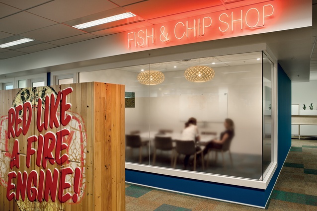
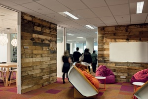
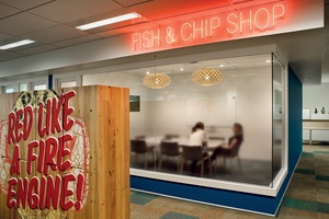
In physical terms, Creative Spaces aligned each level of the fit-out to New Zealand’s two biggest islands. The two floorplates, North Island up, South Island down, broached by a new, and quite handsome, connecting stair, were then broken down with zones referring to urban and rural ideas that reflect upon the lifestyle relationship traditional to the company’s products. There are reproductions of traditional residential building styles, with timber mouldings and windows, a fish and chip shop, walls clad with beer crate timber, a couple of dinghies, custom-made in China, that have been converted into seating, and laneway-style passages with faux-bick walls and grafitti. Naturally, most of the theming takes place in collaboration and meeting spaces, of which there is an abundance.
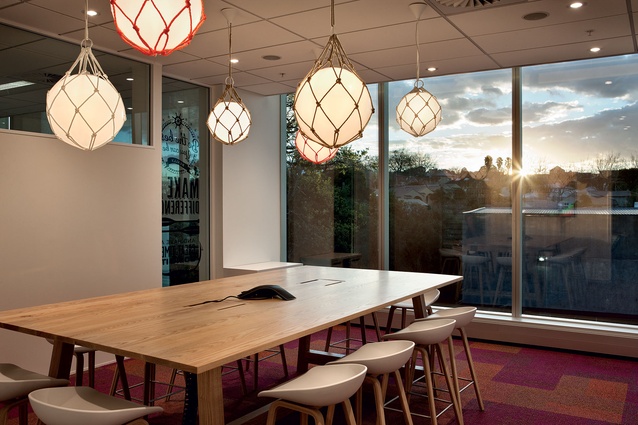
Which brings us to organisation. There are some good moves at play here. Despite the large floorplates, one never gets the sense of an overwhelmingly large open space. Instead, spaces are broken down with colour and device into manageable chunks. The designers have placed the most communal area at the heart of the building. The kitchen/café area, on level one, is a large open space delineated by the removal of ceiling panels to expose services, but painted out in white. Colourful bentwood furniture and banquette seating, and the café’s placement next to the new stair ensures its success as good place for coincidental conversation.

As you move from this central position, past fully enclosed meeting rooms, clearly identifiable with their distinguishing use of wallpaper and furniture, towards the perimeter light, you find more singular and focused workspaces. On this journey throughout the building, you’ll encounter somewhere in the vicinity of 50 colours and shades, and it’s a testament to the designers’ skill that this cacophany of colour (and it must be added, the huge range of furniture) can be quite seamlessly integrated without it all becoming a jarring mess.
Lion’s executive, says Tu’inukuafe, were a big factor in the success of this project. “There’s a huge amount of design in this job, the budget was not at all unlimited, we had to be really focused on how to create and give a really strong sense of theme without doing something that was not flexible over time,” he says. “Lion selected a fantastic group of people to run with the project and we also had a lot to do with the executive leadership team and their MD. They gave very good direction and had a very positive attitude. These projects only happen when you’re given scope from the client and when the client actively gets involved.”


