
St Heliers Bay Cafe & Bistro
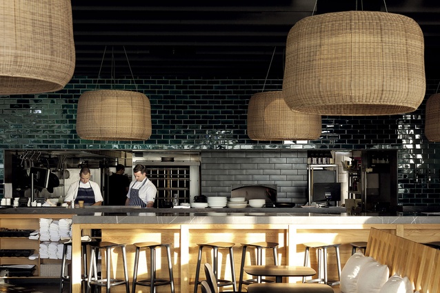
A view over the 1100mm-high bar table towards the kitchen at the St Heliers Café and Bistro.
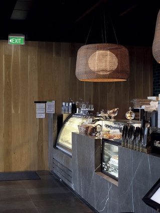
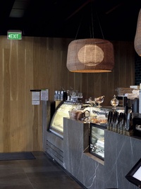
Serving area and barista station.
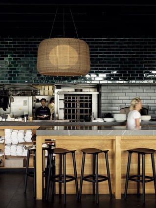
View to kitchen which is clad with matte grey/black tiles.
Hand-glazed, deep-green tiles were employed on the wall facing the café.
View to custom-built banquette seating across window front of the café and bistro.
The seat’s back, which is inclined for comfort, is built to the height of the transom line of the window.
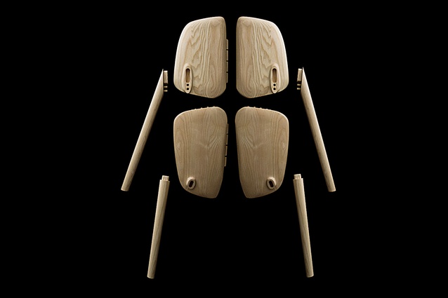
Osso furniture
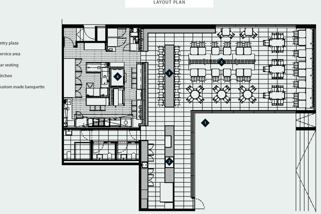
Layout plan.
In the beginning it was a bit back to front, says architect Jack McKinney, of the building into which he was trying to establish an elegant, multifunctional eatery. In this new (and controversial replacement for a row of Spanish Mission-style houses in conservative St Heliers), Ian Moore-designed building, there was no room for a kitchen in the space allowed in the landlord’s original spatial allocation. A good-sized kitchen can take up to 50 per cent of a hospo space, says McKinney, who also designed the Takapuna Beach Café for Hip Group owners Scott Brown and Jackie Grant. This meant a second unit, originally slated for retail, needed to be amalgamated.
As a consequence there were two base-building fit-out scenarios and, it seems, starting from scratch in a brand new building is not always wine and roses.
“The kitchen had a nice Gib ceiling because it was going to be retail; the floor space had raw precast concrete walls, which weren’t particularly plumb, which was a surprise,” says McKinney. “The basalt floor, in an 800 x 400mm module was there, so we had that to deal with, and there was a toilet door right in the front of house, and that’s in a narrow space with all these sliding doors. However, the height and the volume were good, the windows were good… but in terms of character it was a pretty tough environment. The floor space had suspended ceiling tiles and big air conditioning ducts, whereas the kitchen had a better finish. It was back to front.”

Success, in hospitality, is easy to read. On any given day here at St Heliers there is a lively bustle. On opening day, there was a queue out the door. From a functional perspective the owners have ticked almost every culinary box: coffee, breakfast and brunch, lunch, and walk-up dining in the evening, all interspersed with sales of gelato – it is the seaside after all – and cabinet food. And takeaway coffee by the bucket load.
“This operation is trading from very early in the morning to late at night – that’s quite a change in mood and lighting, and expectation in terms of dining experience,” says McKinney.
A good place to start a conversation about hospitality is around one of those things that is imperative to the overall experience – the kitchen. The architect says there was an obvious location for it at St Heliers – not front of house, but with a connection. Defining the kitchen’s actual number of square metres is a “balancing act between getting the front of house working and getting the back of house working and the connection between the two has to be pretty good in terms of service. You think about plates going back to kitchen and how the pass works, and we wanted a good connection visually between the two, which is why we’ve got this great big long pass through here.
In remedying the quirks of the space for hospitality, McKinney and his clients seized upon a linear solution. A serving counter, which includes a barista point, pay station, cabinets for food, and gelato weighs anchor in front of the sliding door entrances. From here, a line was extended, via a high bench with the same counter finish, across the face of the kitchen. It’s length was worked out around the tiling plan of the floor. The café-facing kitchen wall is clad with brilliant hand-glazed tiles that are bright and alluring during daytime and dark, inky and mysterious at night. The kitchen interior is clad with matte-black tiles, quite a departure from the accepted norm of the white butcher’s-tile kitchen. As McKinney wryly notes, “If it’s white and glary you might as well be in front of a glass-fronted refrigerator, it would spoil the mood.”
During the day the high counter serves as a waiting point for takeaway coffee; it’s also a place for casual lunchtime dining or waiting for a table proper at night. It’s a place to enjoy a wine while observing the activity of the kitchen, and if the restaurant is oversubscribed, then it’s a place for dining and its expanse means a number of additional diners can be seated here.
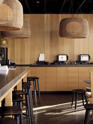
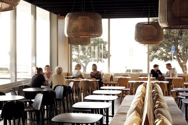
As McKinney puts it, there’s another key “datum point” to the organisation of the interior. That number is 1100mm – the height of the counters and high table; it’s also the height of the custom-made, interlocking timber dividing seat McKinney designed. This consistency gives a clarity and rigour to the layout, a horizontal plane to match that strong linear axis. The designated height of this plane allows views from the back out across the dividing furniture to the views beyond. Another custom-built bench seat runs along the front window of the café. Both are fitted with linen squabs that are comfortable enough to linger for an appropriate length of time.
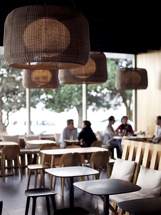
The consistency of this horizontal line meant that there was a good volume available for feature lighting. Over-sized, basket shades were selected. “We liked that they were like baskets or nets, and to an extent we’re trying to be a little ‘near the water’ without being a Fisherman’s Basket. At one stage we were going to have a rope wall, which might have tipped the scale a bit too far.”
Hip Group is a hospitality company that appreciates the benefits of good furniture. Here, with McKinney, it specified the Bourellec Brothers’ Osso chairs and tables, in dark and light oak, which bring a finely tapered elegance to the space. These items were sourced directly from Mattiazzi, the Italian manufacturer, who also customised a table with a central stem, rather than splayed legs, to enable them to be placed alongside the bistro’s bespoke banquette seating.


