
Suburban tranquility: Park Life
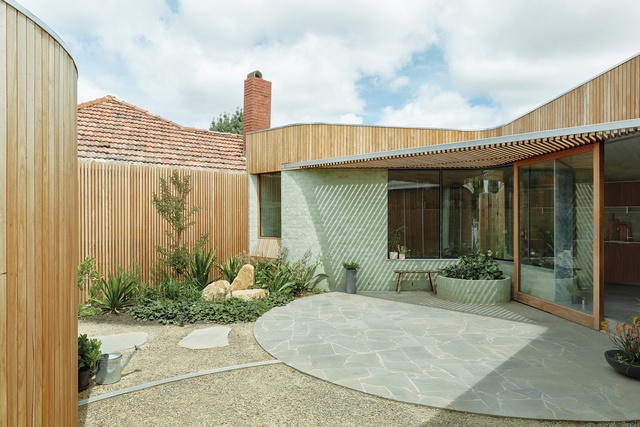
Floor area has been carved out of the house wherever possible and given over to the courtyard.
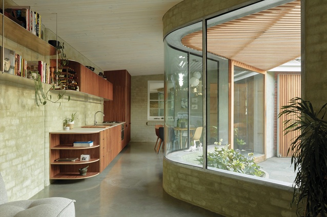
The fluid angles and curves of the extension help to demarcate space while retaining a sense of openness.

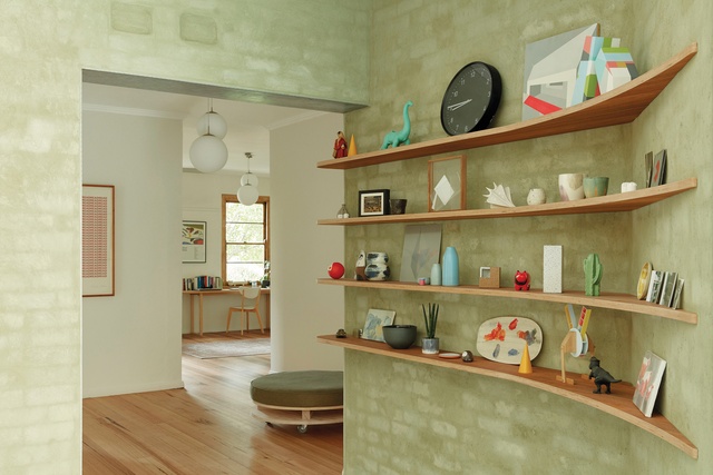
A curved brick wall leads to a spacious gallery at the threshold between old and new. Artwork (L–R): Mike Parr, Ian Wells, Csongvay Blackwood.
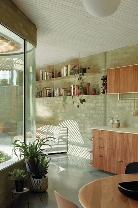
Bagged, recycled bricks with a faint green tint project a sense of aquatic calm in the addition. Artwork: Rebecca Monaghan.
The privacy of the courtyard can be moderated by opening or closing a hinged timber screen.
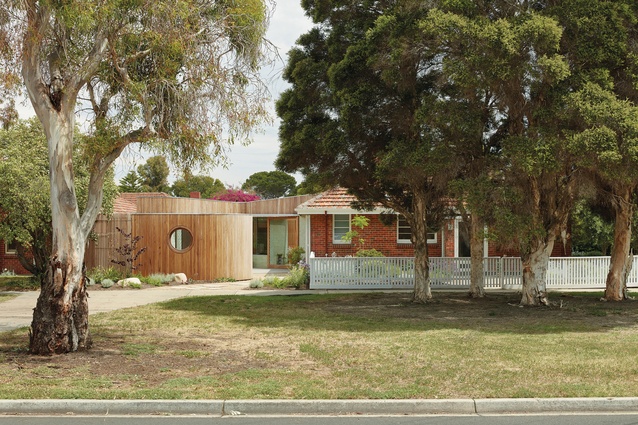
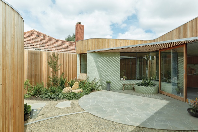
Facing the street is an artists’ studio – an enigmatic landmark with a porthole window.
Architecture Architecture has created a tranquil home for an artist and a curator on this slice of Melbourne suburbia –- the legacy of a 1940s attempt to marry housing and countryside.
Park Life is located on a corner in the Champion Road Estate Precinct, a largely intact pocket of 1940s Housing Commission duplexes beside the vast Newport railyards in the Melbourne bayside suburb of Williamstown. A cluster of compact houses set well back from curving streets with deep nature strips, the estate was designed using the Garden City principles popular in Australia at the time. The movement – an attempt to marry housing and countryside by combining the best of both worlds – was a response to often grim conditions in inner-city tenements and terraces.
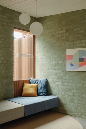
Architecture Architecture has recognized the opportunities and constraints of living on a prominent corner in this “park life” setting. There is a focus on the house’s interface with the public realm – vital when your backyard is also a front garden to a side street. A high fence was removed and, instead, the backyard/front garden is contained by an artists’ studio – an enigmatic suburban landmark with a single porthole window – and a concealed service yard. The privacy of the new courtyard created between the studio and the house can be moderated by a large, hinged screen; the yard can be either almost completely open to the street, with neighbours free to wander in, or secured behind a high wall of timber battens.
The clients for this project, an artist and a curator, came with a good understanding of the site, an open brief and a large degree of trust. An initial sketch from Architecture Architecture captured their imagination: a bold diagonal line of circulation bisects the site and sets in train a series of manoeuvres to maximize space, light and connection. Modifications to the rooms of the existing brick cottage were minimized, its rational wartime austerity left to contrast with the fluid lines of the new addition. However, paths of travel were transformed by the creation of a wide central hallway space that might look inefficient on paper but makes perfect sense when experienced as a well used art gallery at the heart of the house. This space creates a moment of pause in the owners’ daily routines and recognizes the importance of art to their lives.
Throughout the plan, Architecture Architecture has played with degrees of threshold and enclosure to define separate spaces while maintaining visibility. This “pinch points” approach to space-making becomes most evident when you step down into the new extension. Here, angles and curves have been successfully deployed to make the most of limited space. Floor area has been carved out of the house wherever possible and given over to the courtyard, following the rationale that a generous outlook is more effective in achieving a feeling of spaciousness than a few extra square metres inside.
The addition is modest in scale: a calm grotto with walls of bagged, recycled brick pushed hard to the boundaries of the site, their natural variation and a faint green tint projecting aquatic calm. The wall to the courtyard is mostly glazed, maximizing light and outlook to the garden and the timber walls of the studio beyond, which is just a short commute across the crazy paving of the courtyard.
Budget has been managed carefully throughout but the curved, double-glazed, steel-framed window is a strategic moment of extravagance. This central device takes on almost magical properties, expanding the view to the courtyard while controlling the connection between the living and dining spaces. Up close, it is akin to looking through deep water; distance is distorted while views are magnified, obscured or reflected. Conversely, the simple plywood kitchen doesn’t seek the limelight. Sitting sedately against the back wall, its recessed edge details work to reduce any apparent heaviness. Solid aluminium shelves float above, their silvery weightlessness contrasting with the brickwork.
Architecture Architecture has long been careful not to sanitize or erase during the process of renovation. A former external window, now engulfed by the new addition, remains in place; the clear glass replaced with a mirror, it both maintains memories and creates unexpected new reflections. A brick expansion joint is celebrated, with curved corner bricks turning a structural necessity into a shadowy cleft that defines the kitchen.
It can be easy to view a plan with real-estate preconceptions, to look for an efficient checklist of rooms that neatly encapsulates a standardized notion of living. Park Life doesn’t fit this viewpoint. Although modest in size, this house bulges and contracts in unexpected ways, creating a variety of spaces for living and working, all with a sense of generosity that reflects the particularities of its owners and this particular suburban setting.
This article was first published on architectureau.com.


