
The devil is in the details
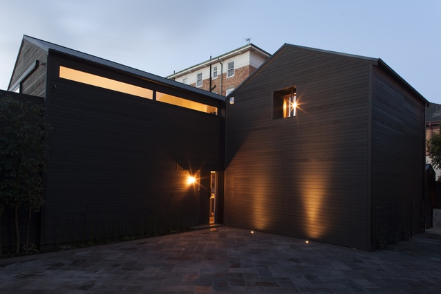
The exterior of the Parnell home.
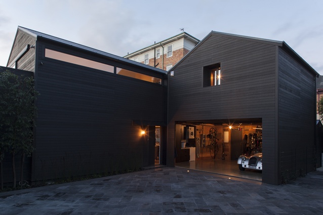
The hidden garage.
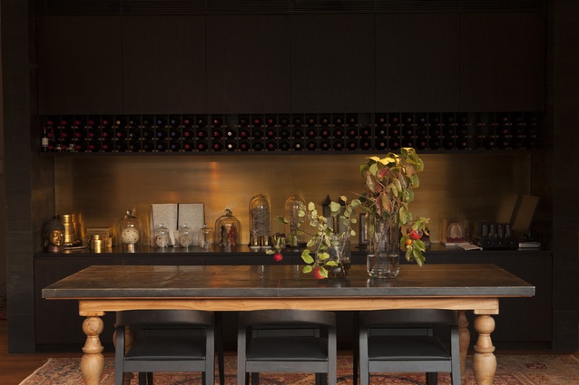
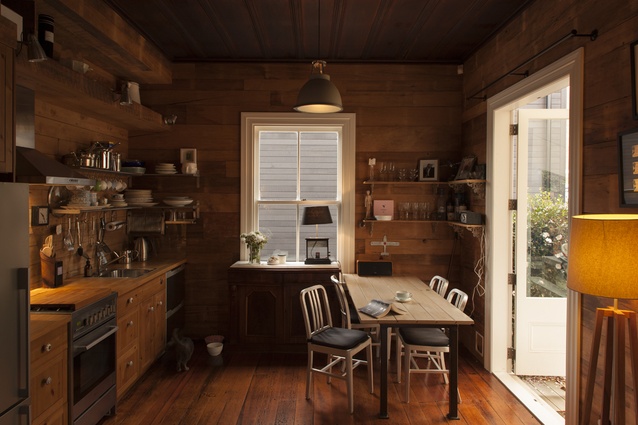
The dining area of the Parnell, Auckland, house.
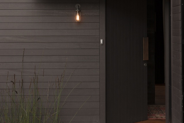
The front door of the new house.
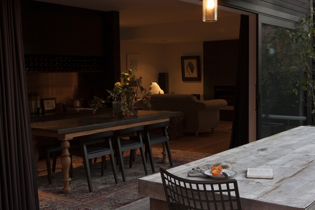
The dining table is paired with Play chairs from ECC.
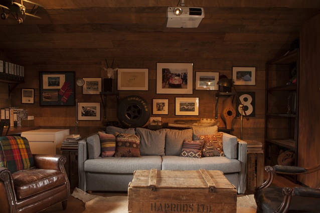
The man cave with cushions from Siggada Kilims.
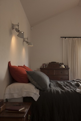
The master bed, made with Siena linens.
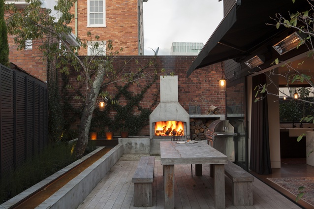
The dining room of the new house opens on to a courtyard with an outdoor fireplace.
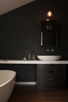
The bathroom is clad in black and is softened with marble finishings.
At the front of the section, the original worker’s cottage serves as a guest wing.
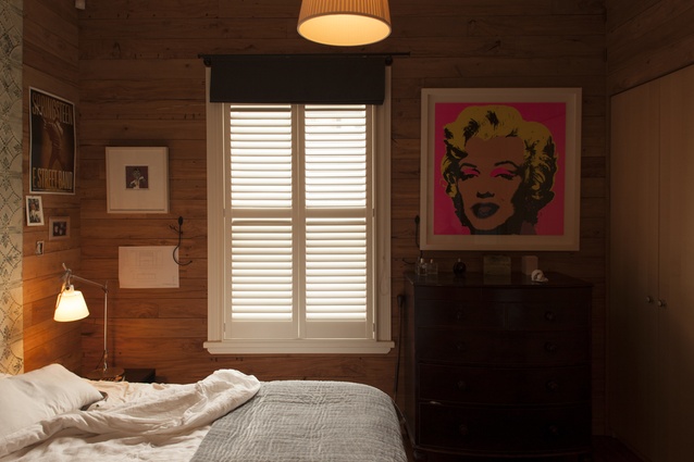
The bedroom in the original cottage.
Welcome to a tale of two houses. One is a buttermilk-coloured, 1860s’ worker’s cottage, hung with a rustic sign declaring it the ‘Aotearoa’. This good ship sails close to the front of its section, just a stone’s throw from Auckland’s Parnell Road. From the street, it seems tidy, unassuming and altogether Victorian.
House two sits on a parcel of land behind the first. It’s a silhouette: svelte in its dark-stained habiliment and barn-like in its countenance. It’s unobtrusive, without obvious affectation.
But, first, some context: this story was almost a tale of just one house. When the owner bought the section in 2010, he did so knowing that it was too small to subdivide. His original plans were for an addition but, after restoring house one, he felt uncomfortable with the prospective loss of the original structure’s singularity. Receiving encouragement from an unexpected quarter – council planners who had seen the quality of work he had undertaken on the heritage-listed cottage – he applied for a dispensation for subdivision. It meant notifying the neighbours – 150 of them – at quite a cost and with no guarantee of success.
But the owner did succeed and he commissioned Maggie Carroll and Jessica Barter, of Bureaux architects, to create the new home. Two rectangles of two storeys were joined to form an L-shape. The longest face of the building was given a wide, narrow clerestory window but, otherwise, no fenestration. The garage was made almost imperceptible behind a uniform face of timber, yet a small window with deep reveals above it hints that the house’s plan spreads laterally into the loft.
Below this small window sits a tidy brass sill flashing, an early hint of attention to detail that is soon joined by another – meticulously placed bronze fixings attaching the cedar boards to the house. There are full-height routed seams to the façade, which involved applying all of the cladding to the face of the building. The result? An exterior that is a perfect grid of boards.
Carroll and Barter are keenly interested in ways to manipulate materials to elevate the experience of a house. As a result, the two-bedroomed home’s interior is rich with moments of unexpected texture. Once through the front door, visitors are met with a built work of art – a monolithic wall of poured-in-place black concrete decorated with the whorls of knots imparted by the rough timber boards that surrounded it when it was poured. This blackened wall was a “one shot” moment, say the architects.
“You do it once. You pour the concrete into the shuttering; you have no idea what it’s going to look like. The shuttering is pulled off and that’s it: your only chance to get it right,” explains Carroll.
This wall is not just an intriguing face; it’s a key organisational device and a separation from the neat linearity of the living spaces on the flipside. There’s the lounge, which exists under a lowered ceiling of tongue-and-groove boards, and the dining area, which slips seamlessly out past black-framed doors to a meticulously landscaped, formal courtyard with an open fire and a water feature. Back inside, the kitchen sits neatly behind a marble island.
Elsewhere throughout the 205m² house, there is more texture. Walls are not plasterboard, but an actual board of plaster, gallery-like and porcelain. The upstairs bathroom is clad in the same material but in black: a nice contrast to the bespoke marble bathroom elements. The black-and-white theme is also evident in the kitchen in the lightness of the surfaces, the darkness of the cabinetry and the black tapware that hovers above a butler’s sink. The dining area is framed by the flipside of the blackened wall, where there is a symphony in brass and dark-timber cabinetry, a platform for a very cool valve amp and a number of bijou objects.
“We spent a lot of time on the brass finish,” says Barter. “The cabinetmakers couldn’t get the finish we wanted and we had lots of people bringing us samples, but we couldn’t get one that was just right. Eventually, we just took to our own sample with a scouring pad from our office kitchen, figured out the finish, got it matched and had it sealed.”
As the owner of the house explains it, the downstairs is nice, well thought out: very much the house he wanted.
There is a second lounge upstairs, however, where he spends most of his time. While the downstairs lounge is a formal affair, a place for drinks before dinner, upstairs is a room for living, for listening to music and watching movies, and to hang a model of the Hindenburg or display a military uniform.
“It’s a man cave within a man cave” says Carroll, referring to the overall masculine aesthetic of the house.
But this room is also, with its walls and ceiling clad in recycled timber boards, something else. It’s the spirit of that much-loved cottage next door, built into the fabric of the
new home.
So, back we go to the cottage, where the renovation that was undertaken is both atypical and familiar. The owner deferred to the character and history of the building and scoffed at any notions of sterilisation via plasterboard walls and canned lighting. When repiling was undertaken, he requested that it maintain the structure’s characteristic subtle lean. Homes this old, he says, are not meant to be square.
With a good builder on side, the owner stripped the interior of the one-bedroomed space. A kaleidoscope of colour was sanded from kauri boards and a time capsule of sorts was found within those walls: 1930s’ newspapers, betting slips and cigarette packets. The rooms were reclad with their original sarking – this time with the unpainted side forward. A fireplace was removed to free up space but the brick chimney was retained to maintain exterior authenticity.
An IKEA kitchen was installed, along with recycled French doors, in the dining area.
The owner would have continued to live in the house, but it was just too small. So, he lives in the new (the old is a guest wing for friends and family) and tells visitors a tale of two houses.
For an interview with the architects, click here.


