The resilience of the diagram
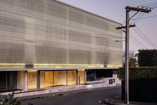
The shimmering street elevation announces a confident new presence in the neighbourhood.

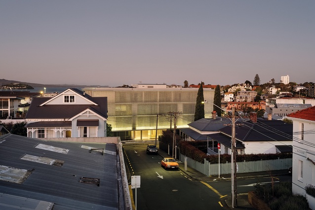
The datum is held against the rise and fall of the streets around it.

Travertine clads the podium and core, before extending out to the footpath.
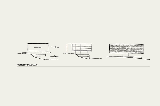
Concept diagrams.
A programme-less edge gifts street views beyond the site and is the result of planning negotiations for a pure floor plate above.

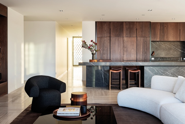
Bureaux’s interiors provide grounded, specific settings for living against the otherwise interchangeable floor plates.
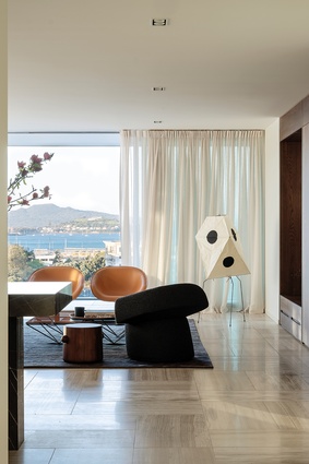
Furniture is generally set low to the ground, guiding long views to the harbour beyond.
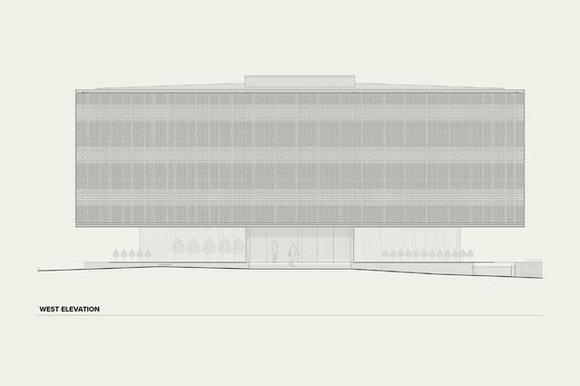
West elevation.
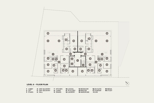
Level 6 — floor plan.
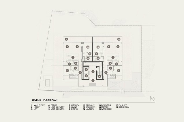
Level 3 — floor plan.
Nick Roberts explores the design evolution of Monk Mackenzie’s Edition apartments in Parnell — from the promise of the building’s early renderings to its nuanced layers of careful composition and the spare elegance of its interiors by Bureaux.
Apartment buildings can be tricky to review. More often than not, they reflect a pre-determined planning and development logic and are simply skinned from a selection of compliant cladding types. This shouldn’t be the case. Apartment buildings can provide great source material in the search for denser models of living, while interrogating the profoundly different ways they are presented through architectural and real-estate media.
On one hand, architectural details command the whole frame while, through other channels, the architecture is barely there at all — apartment living presented to prospective purchasers as little more than a frame for the view.
Beyond the myriad ways that apartment buildings are presented to their various audiences is a search for a core idea that could be taken up by others and proliferate. Aldo Rossi has described the ideal of “an urban artefact… that continues to evolve with the life of the city through constant alteration and accommodation while retaining its irreducible structure”.1 The most enduring apartment buildings, then, are the ones that evolve the typical approach of an urban artefact that is relentlessly typical.
The recently completed Edition apartments are one such urban artefact that has been widely circulated in both architectural and real-estate channels while providing a rich source of inquiry as an architectural type for Tāmaki Makaurau’s continued growth.
I met the team from Monk Mackenzie and interior architects Bureaux to walk through the newly completed building in a moment of quiet interlude — following the photoshoot but before move-in. As we wandered through the apartments in varying states of staging and dismantling, the architecture could be seen both as it would like to be and, more plainly, stripped back — to its irreducible core.

Preceding its emergence on the slopes of Parnell, Edition has existed as a series of carefully composed renders. The project was launched in 2018 and the promise offered by these renders gained traction in both real-estate and architectural worlds: the former through a series of articles announcing new sales records for individual apartments and the latter, with the project receiving an international architecture award from The Chicago Athenaeum.
There are two key renderings of the project, which alternate in precedence, depending on which media channel you’re tuned into. Monk Mackenzie’s marketing leads with an elevational view of its street-facing façade. The legibility of the building’s rectangular volume is gently undone by the layered complexity of a seductive glass-brick veil, which blurs distinctions between one apartment and the next. Conversely, real-estate and lifestyle marketing turns the camera around the corner, with a view that glances across the short façade to overlook St Georges Bay and the harbour beyond.
In its appeal to an aspirational lifestyle, this image substitutes the abstraction of the rear façade for a more straightforward stack of apartments on the precipice — a move that recalls Julius Shulman’s iconic capture of the Stahl House hovering over Los Angeles below. Where the glass brick initially presents as a shimmering, patterned veil, here, it is neatly set within an orderly arrangement of frames and the floor plates become the primary form of expression.
Though each image reveals profoundly different aspects of the project, the careful composition of each one conveys the developer’s (Pink Beluga) alignment with Monk Mackenzie’s precise presentation of its work. That is to say — rigorously edited, atmospheric imagery that tends to describe projects in essence, rather than at length.
With these two visions of the project well established, I was interested in uncovering further layers to the project, through both the design process itself and its realisation on site. Speaking at Monk Mackenzie’s studio, the architects describe the diagram underpinning the development as a response to an atypical site for an apartment complex, with the topography falling sharply away from the street edge. The response is disarmingly clear – a floating volume above, a submerged podium base below, with the space between connecting the street to expansive views beyond.
Over the gestation period since the project’s inception in 2017, the core diagram has been both eroded and enhanced in various ways. The apparently simple form is the product of careful negotiation and staying the course in the face of planning controls and changes to apartment layout that could have led to serious compromise. Where height-to-boundary infringements and the common planning instructive to ‘break down the mass’ can reduce proposals to the point where there is no mass to speak of, Monk Mackenzie argued for a more generous relationship to the street as a trade-off to retain more flexible floor plates and a pure form above.
The requirement for a minimum 1m² of outlook space per habitable room manifested an added layer of detail to the glass brick screen. Associate Ria Lee’s elegant resolution of this control through a hit-and-miss brick pattern achieved the cumulative outlook required by Council and refines an evolving strategy of articulated street-facing screens seen in several Monk Mackenzie apartment projects.
With planning achieved, the resilience of the diagram was tested further with frequent changes to apartment layouts. Monk Mackenzie principal Sean Flanagan describes this process as a complex interplay “between the structural and development logic” of the building.
Conceiving the project as two separate buildings (garden apartments below, flexible units above) established a clear set of parameters through which to test changes during design and documentation phases. In relaying the journey, the Monk Mackenzie team emphasised that the challenges of changing layouts and pursuing custom details against the complex transfer of structure and services was made possible only through a unique culture of trust between developer, builder and architect.

The apartments are approached through a series of meandering residential and light-industrial streets, where the building announces itself queitly yet confidently as something pure within the piecemeal. It is pleasing to see a lack of set-back, and a datum held against the rise and fall of the streets around it. The glass-brick screen commands attention initially and, with the more private rooms generally located along its edge, the view is both invited and denied, simultaneously.
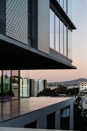
In person, the screen takes on a distinctly different character to those of other well-known glass-block buildings, including the Maastricht Academy of Arts and Maison Hermès by Wiel Arets and Renzo Piano, respectively. For one, it is not all encompassing. The modules recede as the ratio of clear glass increases. The more substantial distinction is that the glass is more brick than block, evoking both the luxury of the development and the industrial context it overlooks.
The most impactful realisation of the diagram is achieved through a substantial, post-tensioned transfer slab that holds the floating volume above and produces some disconcertingly large cantilevers. The honesty of this structure is not straightforward. Only a sliver of the 600mm-deep slab is expressed, while the rough board-form finish gives a notably different presence to the otherwise light and refined palette defining the lobby and street-level apartments.
Finally, it is through the gesture of dramatically lifting the volume above that the planning trade-off for height-to-boundary infringements can be experienced as a strange programme-less space along the building edges with compressed views out to Rangitoto in the distance. The gesture is made even more overt as the view is then immediately denied by the more ungainly neighbours to the left and right.
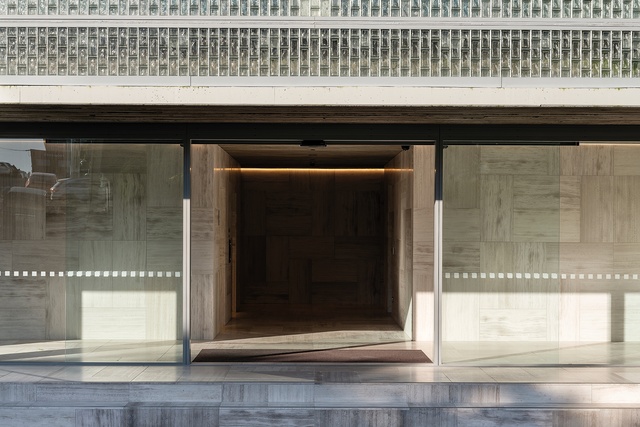
Stepping from the street onto the travertine lobby, the idea of a clear mid-section between submerged and floating volumes is partially lost, with two apartments that wrap around the core. An interesting opportunity for a hybrid apartment type that cuts above and below the podium is tentatively explored through more modest staircases than those originally envisioned.
Regardless, the sunken podium apartments feature unusually generous outdoor space that recalls a common European courtyard model where ground-level apartments project out and are overlooked by their upper-level neighbours. This will no doubt stimulate, or require, a degree of sociability across units that is less typical in Aotearoa.
The apartments above reinforce the sense of a building set within a genuine working city. The atmosphere of the early sun-flared render subdues the vitality of this in-person experience where villa-lined streets give way to a mid-ground of repurposed industrial buildings across St Georges Bay. Traversing the section of Edition highlights the remarkable diversity of apartment types that have been achieved within the clear organisational diagram of the building.
Within this diversity, Bureaux has linked each apartment through a consistent palette of travertine flooring in continuity with the lobby, complemented by the substantial proportions of the kitchen islands and fumed-oak cabinetry. Cumulatively, this has the effect of holding space within the otherwise light-toned background surfaces.
The built outcome of Edition delivers on the promise of its early renderings while adding a series of more nuanced layers to the conversation around multi-residential development. The disposition of the building’s pure form is not a product of planning controls but a subtle negotiation against them and, within the clarity of this gesture, there is plenty of eccentricity to be found.
When so much in this sector is predetermined, this development feels anything but inevitable. As the building settles into its context, it is worth speculating on two ways it could have continued influence — one market driven and the other as an enduring urban artefact. On one hand, the spare elegance of the early marketing imagery in combination with the built outcome will encourage development towards ever-high ends of the market. Details will be further refined and window joinery will be up-spec’d in line with soaring sale prices per square metre.
Underpinning all of this is the urban artefact, where the relative impermanence of luxury finishes gives way to the enduring core of the project.2 The core diagram has a repeatable quality that could be adapted to many steeply sloping sites off main and secondary streets that are commonly found across Tāmaki Makaurau.
With adjustments to acoustic, fire and mechanical servicing requirements, the clear mid-section could be endlessly re-imagined with public programme — connecting street to view, while the lower plinth and upper floor plates toggle between residential and commercial use as the context requires.
Through this adaptation, the underlying urban artefact of Edition could become a form of civic infrastructure. Within the evolving design language of Monk Mackenzie, it is perhaps this typological diagram, as much as the artfully resolved screen, that may be the project’s enduring contribution to the city.
REFERENCES
1 Aldo Rossi, The Architecture of the City, Oppositions Books, 1984.
2 Preston Scott Cohen, ‘The Hidden Core of Architecture’ in Harvard Design Magazine, Harvard University Graduate School of Design, Fall/Winter 2012.