
Towards child-centred design
The new Children’s Hospital sits astride a major vehicle entry to the hospital campus, waiting on the growth of the actual forest at its side.
The new Children’s Hospital sits astride a major vehicle entry to the hospital campus, waiting on the growth of the actual forest at its side.
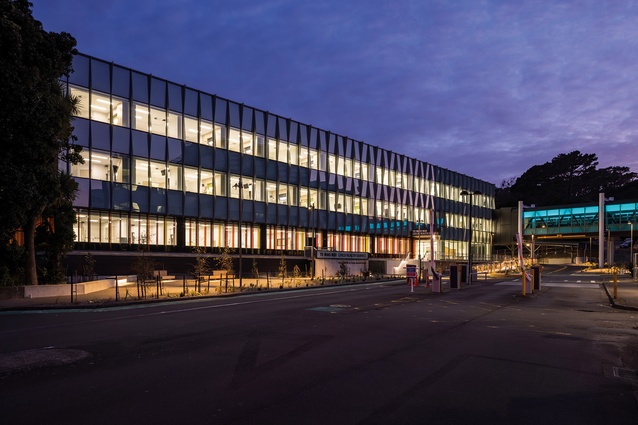
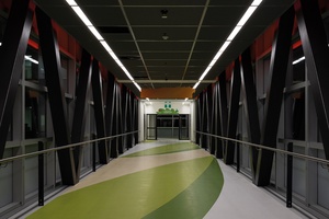
The new building’s exterior façade was intended to relate to the distant, whitebanded Regional Hospital buildings. The bridge link, with its recycled cladding, interrupts the vague relationship.
The bridge connects the new building to the Regional Hospital.
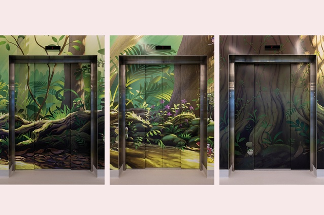
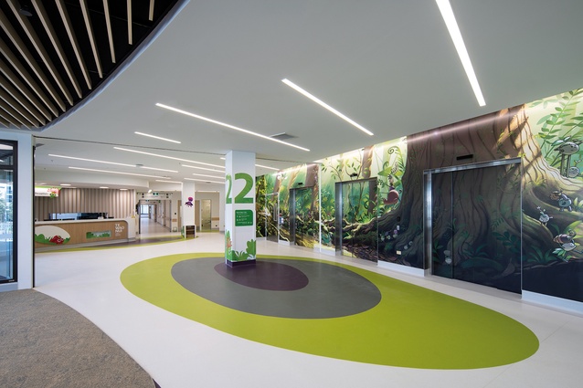
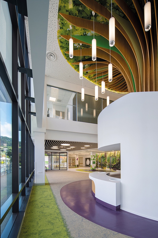
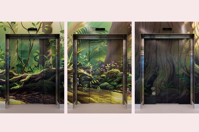
The forest as applied by Wētā Workshop to the lift lobbies. The lowest floor (Level 2) has the forest floor illustrated. Upper floors illustrate upper levels of the canopy.
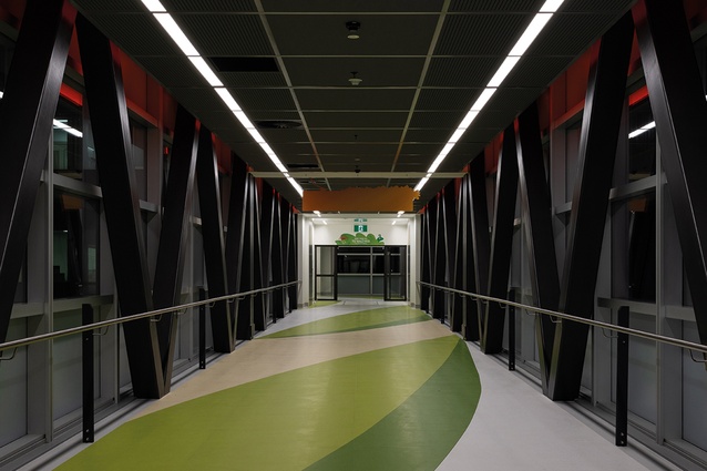
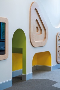
Additional forestry at the ward entry includes giant leaves fallen across the floor.

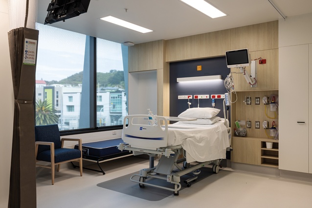
Each overnight room is light and bright with great views to Newtown – a neat hospital version of homely.
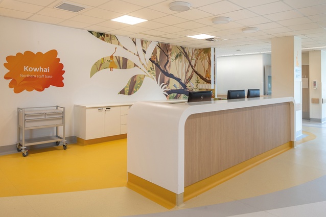
The ward reception area.
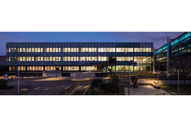
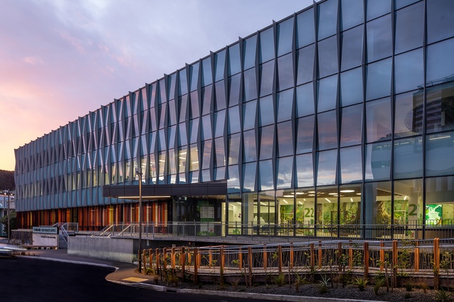
The south elevation presents a very uniform, measured appearance with vertical fins and building entry dematerialised within the main glazing rhythms.
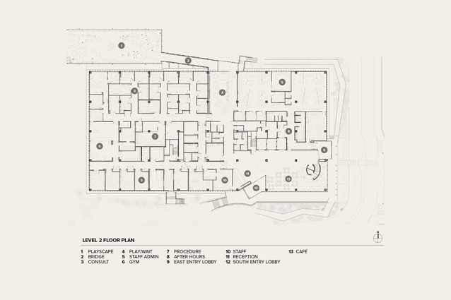
Level 2 Floor Plan.
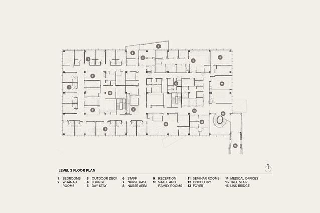
Level 3 Floor Plan.
A children's hospital has existed in Wellington since 1912 and, like the first one, the newest exists by virtue of public donation — the current building has benefited to the tune of $50 million from Wellington property investors and benefactors Dorothy Spotswood and Mark Dunajtshik.
In between times, a specific building was built in 1988 and this is still partially in use today, even though the new building has been substantially complete for about a year. The idea to build a replacement is, of course, absolutely fantastic — the old is tired and compromised and not so great from a user perspective, whether that of patient, visitor or clinician.
The Children’s Hospital caters for patients aged up to 16 years old and provides consultant spaces, day care and overnight facilities. It has nine shortstay beds, and overnight medical wards for 17 in one and 23 in the other. Interestingly, its bed numbers are similar to those of the existing children’s ward, although the facilities are much enhanced. The Spotswood-Dunajtshik $50-million donation was combined with $33 million of Capital & Coast District Health Board funding and $10 million of community funds to make a total project cost of $93 million.
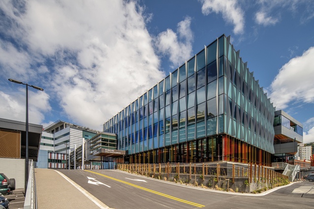
From a distant view, the Children’s Hospital appears distinctly like a commercial office building in intent — the giveaway to some other use is the plethora of air-conditioning equipment on the roof. Closer in, the relationship and the bridge to Wellington Regional Hospital become clearer. While the horizontal banding and terracotta base of the neighbouring building were evidently drivers for the Children’s Hospital, fortunately, the referencing is rather vague. The multicoloured fins at the base and the relatively tall glazed areas of the Children’s Hospital are far more open and welcoming. Vertical fins control shading and, with an Aurecon study to prove a better sun control outcome than that achieved by horizontal louvres, this is a further welcome differentiator. For maximum visual impact, the fins are, of course, best viewed obliquely.
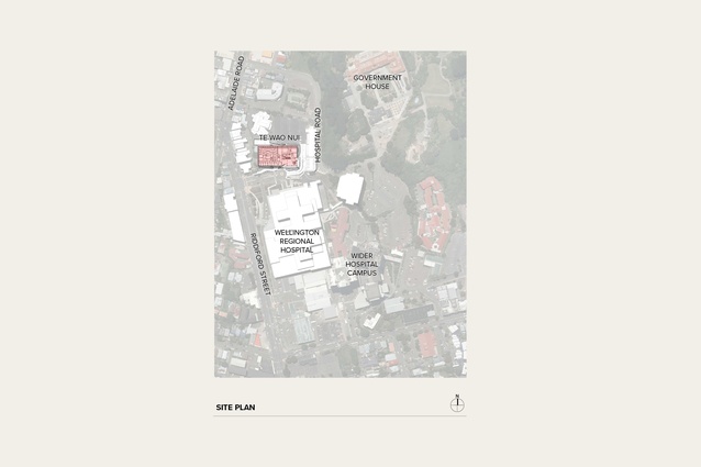
The new building sits to the north of the existing Regional Hospital complex behind a series of heritage buildings and on a site recently occupied by cars, close to the site of the since-demolished Nurses’ Home.
The resulting building platform is large and regular but sits skewed away from the hospital’s access road and the adjacent existing buildings. It sets up a new development grid for the hospital as its new-builds move northward and creates a sliver of the new building opening up towards Riddiford Street — with a somewhat more gracious entry sequence as a result.

The Children’s Hospital is also on an overland flow path and this has required the creation of a permeable space under the ground floor. Water can flow under the building and down the valley towards the Basin Reserve, should the unthinkable happen. It seems like one of the new normals in the context of regular climate-change-induced events.
While the basement is set up to cope with water ingress, it is also the site of another resilience measure to ensure the building reaches its Importance Level 4 (IL4) seismic standard and can withstand a one-in-2500-year seismic event. Each of the 45 columns in the 68 x 34 metre grid sits on a large friction pendulum bearing — an American-manufactured form of base isolation which allows horizontal ground movements of up to 1500mm. On its own, this level of movement might seem unremarkable but the building has a bridge connection to the Regional Hospital — the bridge accepts movements of 1500mm at one end and 600mm at the other, although a close look is needed to find the seismic joints at all.
The bridge connection reuses cladding from a demolished Wellington waterfront building: one of several sustainability measures that are mostly in the services sphere. It’s a good idea that was difficult to execute on site and gives the ensemble of buildings an eclectic feel rather than one of cloned similarity.
Every part of the Children’s Hospital seemingly has had a technical challenge of one kind or another so it’s a credit to Michael O’Brien and Studio Design + Architecture’s team that the invisible hasn’t been the main event and the care of the building’s patients has remained the most important part of the project. Unusually, the architects came with the benefactors, rather than through a DHB selection process. They have approached the project as hugely creditable firsttimers in hospital architecture — there was nothing to repeat from a previous time so everything needed an investigation, first-principles thinking and the utmost care in its execution.
There are three floors in the building, all with clinical functionality. The ground floor, raised above the base isolators, has reception, consulting for day patients, staff spaces and a café. The upper two floors have the main wards and day patient procedural areas. Bedrooms are arranged around the perimeter of the building, bringing light and views to the youngsters within. An internal area, of mostly clinical spaces, is circled by a continuous corridor with legs running towards the outer windows so that the internal reaches have an orientation to the outside. It seems a little thing but the amenity is so easily lost to space-hungry briefs counting up each square metre and its purpose.
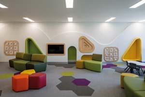
The idea of a forest connects the three floors, internally at least. The motif was selected with the help of Newtown School students and, since plants have a relationship to health, was endorsed by the hospital’s Māori Partnership Board. The forest motif manifests itself as giant leaves printed on the flooring, with a Wētā-provided mural on each floor at the lift lobbies and an impressive metaphorical timber tree snaking its ply fins around the connector stair from ground to first floors.
The building has two central aims of ‘clinical integrity’ and ‘a child-considered environment’. There is no question that hospital buildings are technically and spatially challenging — and it seems that the building’s clinical environment has indeed been optimised. A year after most of the building had been in service, one of its supervisors reported, when asked, that she would wish to change nothing material.
For many, hospital life is much more dependent on the staff than on the space — the staff members are the people who make a real difference with their skills and dedication. In the Children’s Hospital, staff spaces have a bright-green edge trim to the floors as a kind of differentiator from other patient-oriented space. The staff areas feel calm, spacious and generous.
That the clinical environment meets the highest standards (and it certainly looks as though it does) is probably enough. Hospital visits can be frightening times for children and parents alike so the white, bright hospital feel may well be reassurance in its own right; that, on its own, counts as child-centric.
Some years ago, though, I was pushing my daughter in a wheelchair from the old children’s ward through the ‘new’ Regional Hospital and, on reaching our destination at radiology, she suddenly turned to me and, waving her arms at the nondescript and unremarkable interior, said “Dad, you’re an architect — why is it that hospitals are so hideous and badly designed?” That’s a 14-year-old’s view of the whitebeige medical environs: one which I suspect isn’t going to be made happier with just extra floor patterns and appliquéd graphics on the lift lobby and the fronts of the lift doors.
However, there are quite a few features, called out as ‘design features’, that provide a much-improved level of patient welfare: the children/young adults have their own very well proportioned rooms (with two exceptions); each room has an en suite; parents can use fold-out beds (not worn-out La-Z-Boy chairs) to stay overnight; and there are whānau lounges in which parents can make tea and toast. It’s pleasing to hear that cost control hasn’t emasculated the brief and the amenities that will make hospital life a bit easier for its temporary visitors.
So, certainly, the Children’s Hospital has made some considered arrangements to suit its visitors — there’s also a little gym, play areas, a play deck and an outdoor playground (not yet in use) — but it’s not child-centric in the sense of making a paradigm shift away from what our expectations of hospital space might be. That’s yet to come.


