
Wellington’s airport terminal gets a new ‘rock’ look
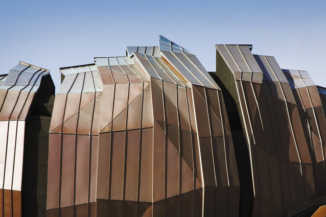
Detail of exterior cladding of the new Wellington Airport International Terminal.
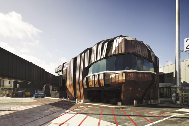
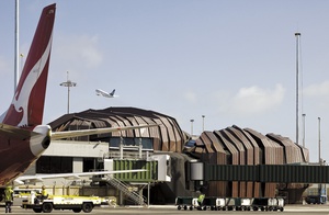
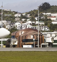
Terminal and passenger boarding bridge.
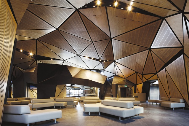
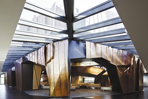
Interior of the new terminal.
Studio Pacific Architecture and Warren and Mahoney set out to produce a new airport terminal that is a destination in itself.
When the design of the new international terminal at Wellington Airport was revealed in 2009 the people most surprised by the orange rendered forms were the architects. Somewhere deep within the publicity machine, a graphic designer had prepared the image and, told that the exterior was to be clad in copper, chose orange. The colour of copper. In his head, perhaps. And thus, within hours, several years of comprehensive design borne out of a rigorous conceptual process that sought to integrate architecture and metaphor at the deepest level was reduced to a pumpkin. Well, two pumpkins.
The talkback lines rang hot, and architects – specifically and generally – were pilloried. What were they thinking? Fancy abominating our airport (the good citizens of Wellington are remarkably proprietorial when it comes to infrastructure). The architects, the clients and a handful of others who knew better may have lamented that they did not sight the image before it hit the media, but in this business, perception is all. If you want your building to be perceived in a certain way (always a tall order) you are obliged to manage perceptions, at every step. This building was always going to be about perception, and before the first sod was turned its identity was embedded in the public’s mind. The building is now open and while it seems a long time between drinks, the pumpkin impression is indelibly imprinted, primarily in the minds of those who haven’t been near it. Perhaps they should leave the country and check it out as they depart?
Wellington airport is tiny – a mere 110ha compared to Auckland’s 1600. Many remember the airport’s original draughty tin shed with fondness (memory is kind to things that have gone for good). The shed was replaced with the soaring domestic terminal designed by Craig Craig Moller in 1999, a remarkable piece of architecture which has changed the way Wellingtonians travel the country, but which did nothing for those departing it. The international terminal was left to one side, inhabiting an agglomeration of three buildings built at different times. All in all there had been five buildings constructed at the airport from 1976-1999, including the rock solid Ansett (remember them?) Building of 1987, a tour de force of columns, beams, slabs and intransigence.
In the early 2000s the Wellington Airport Company went through an extensive rebranding exercise, presenting itself as “Wild at Heart”. Good Lord, where did that come from? Perhaps from David Lynch’s film? Anyway, although the sobriquet was greeted with cynicism, “Wild at Heart” it is, and the descriptor was the precursor to the new terminal, which is perceived to be a “good fit” with the brand. This is, perhaps, the core of the controversy surrounding the new terminal. There are, it seems, two kinds of travellers in this world: those who like their airports utilitarian, functional and unbranded; and those who are buying an experience, not a ticket, living a dream (not necessarily their own) and tracking it all on their smartphone. This is a new millennium, after all, and we should get with the programme.
Yes, the programme. It called for an enlarged international terminal to cope with increased traffic. The previous terminal could handle 500 busy-hour passengers; this number would increase to 1,000. Work has been staged over several years with the first stage addressing the processing of passengers, and the next increasing the number of gates from six to eight with a new terminal to service them. The airport company engaged Airbiz, a terminal design specialist, to diagnose the needs and plan the many flows of people and cargo, and the security required for the terminal. It is a complex process, affecting everything from duty free areas, security, and customs right through to baggage handling. The goal was an improved departure point that would handle more people. Essentially, the task was to make the pipe bigger; this in turn provided the opportunity to build a bigger departure lounge.
The constraints on the building footprint were significant. Sited to the north of the new domestic terminal, the size of the new building was limited by the fuel tank farm to the north, the road to the east and the taxiway to the east. What was left was a very confined triangle, a wedge of a site. The conservative option would have been to work in with the mélange of existing buildings, focus on functionality and efficiency and, inevitably, produce a prosaic result. Wellington Airport had done its research; airports around the world are generally conservative, and rarely branded. “Wild at Heart” wanted different, and different they would have.
After discussions with a number of architects, Studio Pacific Architecture was appointed to the project. The original concept was for a large curving wing floating out from the terminal – an expression of flight to match the domestic terminal. It was exactly the sort of thing that the airport company had seen around the world but, after some development of this idea, in 2006 the client called a halt. It wanted something different. Lloyd Morrison, the director of airport owner Infratil, said the new building had to be “edgy”.
By this time, Warren and Mahoney had been brought in to collaborate with Studio Pacific. Both practices welcomed the challenge from the client and embarked on an extensive conceptual process which produced the finding that the airport was not about flight at all; it represented Wellington. Thus, the designers looked to the city’s rugged south coast, and its rocky landscape. After countless photos had been pinned up, it was inevitable that the word “rock” should enter into common design coinage.
It came down to a choice between contrasting ideas: the chic cool of the “Wing”, a stealth bomber, dubbed by the team as the “Millennium Falcon”, versus the rugged rudiment of the “Rock”. Rock beats scissors every time. There were other ideas along the way: for example, the “Oilrig” – a platform floating in a sea of tarmac – and the “Black Pearl” – but the Rock won through. But what is a rock (the team asked themselves)? Are the passengers in it? On it? Under it? Between it? The architects settled on the latter trope, which sparked the development of the building – this was the thread running from idea to metaphor to built form. The rock grew, shrank, multiplied to two and then three and split apart. Models were carved out of foam and then scanned in at Weltec to produce a digital from. The designers then went back to physical models to explore the concept further.
Three forms emerged: the main rock and the nose rock, which make up the external forms, and the ramp rock, which is within the internal space. The forms would be clad in copper, creased and folded. Fissures would open up revealing, on the top, a black sub-strata, and on the sides, windows to the building’s interior. The rocks nestle in the armpit of the existing buildings extending out to the maximum building line on the tarmac. In terms of construction, these rocks are more like shells. Once the concept was in place the architects, along with the engineers, Beca, had to work out how to build it. Mainzeal came on early as the main contractor and helped resolve how to build the structures. A series of irregular, but aligned, steel portals create the volume. Ribs span across these portals, which are sheathed and waterproofed. On top of this is a ventilated cavity with another layer of construction above it, also weatherproofed and clad in copper sheeting.
The interstitial space – as high as 2m in some areas – achieves a number of things. It maintains the external forms as rocks while allowing the internal spaces to be shaped slightly differently as rooms; it also contains some services and manages heat gain in the external cladding. Mainzeal suggested steel for the supporting structure and timber from there out because the subtle changes in form and shape could best be achieved with carpentry. The rocks are joined to the existing building with sloping glazing with pivot joints at one end and sliding joints at the other, allowing the building to move independently. Internally, the transition form the existing building is marked by a change in flooring, highlighted by the glazing above.
Going into the rocks is like entering a reverse Tardis. Externally it is difficult to get an idea of the scale of the buildings but they appear quite big. Once inside, they are small and intimate. The main “rock” is a lounge with broad molecular seating with a roof dome of shards of plywood panelling that flow down to become walls. Some of these panels are slotted for acoustics and air conditioning. Pylons of copper cladding break through the line of the glass to connect with the floor below; the grey slate floor contributes to the muted palette. Within this space is the black tiled ramp “rock”, which contains the ramps to the gates. It also has stairs up to a mezzanine for better views out to the north and back down to the interior.
This main space opens on to the “nose rock” – so called because it reaches out to the tarmac where planes nose up to it. The level rises to a viewing platform with a wide window seat. Airport lounges are frequently closed interior spaces that shut out the outside world. Not here, where opportunities for views out abound: to the north, across the tarmac is Mt Victoria; to the south, through the departure lounge to the South Coast; up above, through the sloping glazing, to the sky..
Airports are designed to move people quickly and efficiently, and airport architecture normally reflects this, encouraging movement and discouraging pausing. But this new terminal is all about the pause; it provides moments of reflection before the real journey begins, and yet the excitement of travel is present, for example in the tessellation of the ceiling. Pausing required, movement allowed. This is a luxury rarely seen in airports and one likely to have people checking in early simply to spend time in a space that doesn’t condescend.
It is rare that a client would take these risks in such a highly technical building. The easy route would lead to the slick glass box, corporate and conservative, brooking no engagement with its users but processing them quickly and efficiently. The Wellington Airport Company has stuck its neck out – put its rocks above the parapet – with a brave commission. The client placed enormous trust in its architects, and they have responded with a building that is rich in – but does not rely on – meaning. The building is Flintstonian in form – rocks possibly, pumpkins, no. Long after verdigris has cloaked the cladding, it will be the sensitive, intimate interior of the “Rocks” that will be remembered.


