Colour Collab: Buster Caldwell
In his time off, the creative director for the Wonder Group makes engaging art from photos of banal architecture. In this colour collaboration with Resene, he explains his process and how colour fits perfectly within it.
What does the process look like when you select colours for your artwork and how does this differ when you work on interiors?
Buster Caldwell (BC): Colour brings feeling in the same way that texture brings time. Shiny equals new. Rough equals old. And, so, I guess colour is a statement of how you feel or, probably, more how I want you to feel when you see the thing I’ve made.
Interiors are similar to art. Well, I actually think interiors are art, so it becomes a little difficult to pinpoint how the process changes between the two. The only difference I find is that, when I work with a client on a space, we’re both looking at the same vision and so move together on the journey – we’re partners in crime. With art, I just have to make it up and hope that the other person will like it in the end. In this way of thinking (where colour equals feeling), selecting colour is the exact same process for anything. You unpack the way someone should feel when they see it and then work backwards from there. I think it’s more logical for me, less intuitive. I think about how it should feel, rather than feel it when I see it.
What do you look for in a building when choosing to reference it for your artworks?

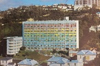
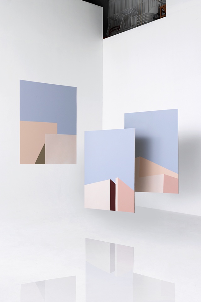
BC: It has to be ordinary. I fall in love with the little parts of boring buildings and try to find the frame that shows each building’s most boring bit.
I find those types of building everywhere: mouse coloured, all shades of gloggy grey and brown washy beige. So, the colours I add are fake but I guess that’s the part that I can choose, where I can add my own small mark. It makes them more ‘pop’ and is where you can make an ordinary building fun.
What appeals to you about creating triptychs?
BC: I wish the answer were poetic but it’s a process thing. Paint takes time to dry and I find time to paint only on Sundays, so the process needs to be efficient. I’ve found this perfect point of flow where I mask one colour on all three panels and, by the time I have applied colour to the third panel, the first is dry and ready for re-masking. Two would be too wet, four too dry!
All of the thinking is already done before you touch your first drop of paint. The lines are marked out and the colours are selected. It’s then just about being a machine.
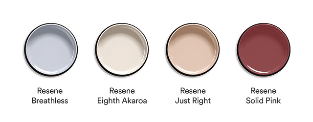
Tell us about how you chose the colour palette for your selection here. Where did you find your inspiration?
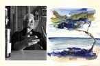
BC: These paintings were made as gifts for friends. So, I guess the colours are what I feel when I think of them. Shades of light, warmth, fun and optimism.
See more from the Resene Colour Collab series here.
ArchitectureNow works with a range of partners in the A&D supply sector to source appropriate content for the site. This article has been supported by Resene.