Material Focus: Material Creative
Olivia Patience – one half of award-winning interior design firm Material Creative – discusses some of the selections made for the studio’s colourful and tactile Naumi hotel Auckland Airport.

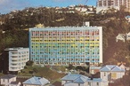
Interior: What influenced your material choices for the Naumi hotel? Did you take any references from the pre-existing Hotel Grand Chancellor?
Olivia Patience (OP): Our brief from the client was to take this original building and transform it into a hotel like no other within the New Zealand market: a true experience and feast for the senses. Part of this requirement was also for it to be intrinsically ‘Kiwi’ and to have ‘no white’. Without being too obvious for cliché, we decided to take inspiration from an iconic national bird, the tui. We gleaned inspiration from its colour, hues, layering and song, and allowed this to lead us on a colourful and rich design journey, including jewel tones and gold-leaf feathers.
Interior: What colour, material and, more generally, design considerations did you think were important to bring to this project?
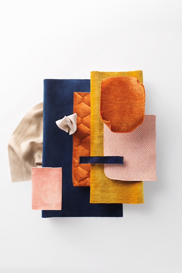
OP: The rich jewel tones really set the scene for our colour and material choices, and it was important for us to refer back constantly to the breast of the tui, which is so vibrant and textural. We kept referring to our concept to keep our design consistent, yet pushing the limits wherever we could in order to fulfil our brief of a completely unique design experience. We needed moments of impact throughout this hotel and this was an important element in its design success.
Interior: How did you arrive at the textile materials that you selected?
OP: In high traffic areas, any fabric you are putting on seating needs to be really durable and of a commercial grade. This can limit choices, especially given we were after rich jewel tones! Mixing the aesthetic and practicality of materials can be difficult sometimes but, with the Plush range from Warwick, the colour choices are vast and the velvet finish helps them to appear rich – the perfect combination for what we were after.
Interior: How would you recommend approaching the design of a boutique hotel? Tell us about what you have learnt from the process.
OP: With each project we do, we try to develop a really strong story and/or theme early on to back up our design intent, and this is a hugely important part of our process here at MC. It’s not about choosing colours and materials that we ‘like’, it’s about choosing the appropriate ones to fit that idea. The stronger our idea, the more we can reference it and the more coherent our design is. Flexibility is also key; ideas develop and so, too, should your palette.
Click here to hear from Walker Mitchell’s Kirsty Mitchell on the Material Focus for Hobsonville Point’s Fabric Bistro.
ArchitectureNow works with a range of partners in the A&D supply sector to source appropriate content for the site. This article has been supported by Warwick Fabrics.