Rachel Carley on her work
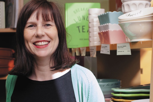
Rachel Carley with some of her ceramic work at Sabato in Newmarket, Auckland.
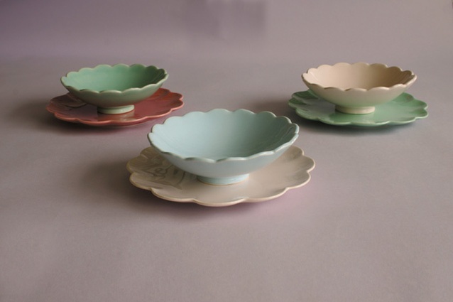
Rachel Carley lotus bowls and petal side plates.
The designer speaks about designing ceramics and her relationship with interior design.
Can you tell me about your work as Curriculum Leader of Interior Design at Unitec?
In my current role I am responsible for developing the pedagogical focus of the Interior Design pathway within the Bachelor of Design and Visual Arts. I also teach studio practice and interior design history and theory courses at undergraduate level, and supervise Masters students in Interiors, Painting, and Object Design. I work with a small team of great academics delivering research-led teaching informed by current discourses and debates emerging within interior design practice and criticism. Project briefs interrogate the ‘expanded field’ of interior design practices including aspects of performance design, commercial and retail environments, exhibition design and transdisciplinary practices such as installation.
You started making ceramic pieces in 1994 when you were studying architecture. How did this happen?
I enrolled in a brilliant course called Contemporary Theoretical Positions. This course provided a venue for new and emerging academics to disseminate their own research. The lecturers included Peter Wood, Christine McCarthy, and Brent Allpress. Their research was grappling with key issues around identity politics, post-colonial readings of territory and the relationship between structure and ornament in architecture. An assignment for this paper marked my first foray into ceramic transfer decoration. The cup and saucer pattern entitled For Domestic Employment (in homage to a range of designs on jasperware, by Lady Templeton for Wedgewood) was applied to white readymade cups and saucers. A building at 74 New North Road inspired the design. The façade of this structure is punctuated by silhouettes of a Rachel Carley speaks to Houses about designing ceramics and the relationship with her interior design work. Interview by Claire Ellery Portrait by Samuel Hartnett design people female figure that are connected by a tracery of lines that form a diamond pattern across the exterior. I was very fortunate to sell some of these pieces in Vivienne Leung’s shop Tessuti in Jervois Road, Ponsonby.
Is there a strong relationship between your work as a teacher and your ceramic work?
Yes. The ceramic wares were borne from an interest in casting, collecting and revising taxonomies. This interest later informed my Doctoral research into the architecturally scaled castings of the British sculptor Rachel Whiteread. My teaching, research and design practices continue to evidence an ongoing concern with peoples relationship to the material world, in particular peoples complex relationships to objects and rooms: relationships that can negotiate a continuum from the benevolent to the deeply unsettling. These interests inspired two design studio briefs, one examining the thematic and structural complexities of George Perec’s astonishing novel Life: A User’s Manual, and the other investigating the potential relationships between still life painting and spatial design practices.
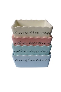
Your ceramics are often detailed with Gertrude Stein quotes, such as ‘rose is a rose is a rose is a rose’. How did this thread in your work come about?
I was introduced to Gertrude Stein’s writings while completing my BA in Literature. I was especially interested in her meditations on the rose. It is my understanding that Stein was tired of the hackneyed metaphors surrounding the floribund. Her famous maxim “rose is a rose is a rose is a rose” first appeared in her poem Sacred Emily in 1913. Grandiloquence was rejected by Stein and replaced by plainlanguage that made the rose red again by considering it without comparison. Stein used variations of this line in many of her compositions. I had a eureka moment when I discovered the book A Stein Companion edited by Bruce Kellner. It contains an A-Z of quotes by Stein. A ceramics collection seemed predestined when I saw she had written, “Indeed a rose is a rose makes a pretty plate”. I enjoy the way her quotes wrap about the ceramic vessels seamlessly so that you can begin the sentence at any point.
What is the inspiration for the shapes and forms of your collection?
The ceramics are based upon found forms that are then altered through the removal or application of detail. The original objects are made from metal, crystal, glass, ceramics or brass. They are retrieved from antique shops, op shops and clearance houses. The intention was to create a ceramics collection that brought together a variegated group of waifs and strays, providing an afterlife for abandoned objects. These disparate characters are transformed by the ceramic casting process to begin their lives anew as part of an extended family of eccentrics. The ceramics can be collected in a number of ways. Some people focus on a building a monochrome collection, whilst many assemble a pick and mix collection containing an array of colours that can be curated in a number of ways: by shape, colour and/or size. I hope the ceramics also fi nd themselves at home with other collections. For example, a collector of Delft or CorningWare can assemble a suite of duck egg blue and royal icing white plates. Poole fans can select pale petal pinks and tiffany greens to sit alongside their grey-marled cups and saucers with pastel interiors. Crown Lynn devotees can fi nd a range of creamware bowls with bibendum curves or matt glazed vases to accompany their swans and conch shells. The vegetal forms and crustacea made by Carlton Ware go well with lime green and buttermilk platters and plates.
Can you describe how you choose the colour palette for your designs?
The glaze colours were inspired by the pastel hues employed by the eighteenth century Scottish architect Robert Adam in his interior schemas. They also recall the colours used for kitchen equipment and plumbing fi xtures of the 50s and 60s: the buttermilk baths, duck egg pedestal basins and the Kitchen Aid mixers of the ideal housekeepers domicile. At last count there were 17 pieces in the collection, available in 14 colours. When choosing new colours I always consider what types of food would look best on them. For example, avocado on lilac, cous cous on golden syrup, chocolate on tiffany green and strawberries or cherries on duck egg blue are some of my favourite combinations.
How and where are your ceramics produced? To what extent does the production process inform your designs, if at all?
My ceramics are slip cast earthenware and are made in New Zealand. The slip casting process does determine what can and cannot be done. There have been many occasions when the research and development phase of a new objects’ life has been very protracted!
What pieces are you currently working on?
I hope to have three new pieces ready for Christmas: a matte cream facet vase, and two new bowls if all goes well.