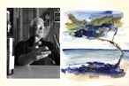
Colour Collab: Chantal Gaiqui
In this series brought to you by Resene, Chantal Gaiqui head of interiors at TOA Architects, discusses her passion for creating innovative and engaging spatial design solutions, connecting people to the land and the land to the people: piki-a-rangi, para-a-nuku.
What led you into the world of architecture and design?
Chantal Gaiqui (CG): Prior to settling on interior design, I started out as a performance pianist, studying BMus in Performance at Auckland Uni. I was also part-time modelling and acting at the time, and I took a few years out to focus on that fully. I then moved from music to study architecture — I loved the broad range and variety of skills, considerations and opportunities that designing spaces and places brought together.
Architecture is very much like music but expressed in a visual/spatial language as opposed to in sound. The maths, patterns, harmonies, counterpoints, rhythms, proportions, ratios, colour, texture, timbre, light… these are all parts of the fabric of both worlds. I’ve been involved in commercial interior projects from my start in architecture and this is where my passion lies.
Tell us about the use of colour in your work.
CG: The senses and how we experience space is really important to me and colour plays a big part in that. Colour (or lack of it) can heighten or reduce certain feelings and emotions, invoke memories, reference other things, indicate a mode or function, speak of a community, culture or brand — it’s incredibly powerful. Colour reflects or works in with the context of the space, the place or the people in it. I often use colours of the whenua in which the interior sits and its surroundings: so, natural hues, layered, saturated, up or down. Hence, they are colours that enhance what is inherent in the project, conceptually and physically.

What influences your work?
CG: Everything and anything inspires me, from film to fashion, travel, fabric and music, to the anime my son is watching at the moment. I love the patterns, textures and colours found in rocks, stone and the earth; I have a slight obsession for photographing our beautiful coastline rocks using a macro lens. I love watching the latest runway shows and being drawn into the world the designer of each show creates. I love Sabine Marcelis’ work with pure forms, glass and resin, textures and graduating colour.
What was the thinking behind your collab?
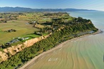
CG: The collab brings together Aotearoa (Maungawhau Mount Eden and coastal rocks), Mauritius (Chamarel and the seven colours of the earth) and Mallorca (Valldemossa and the music Chopin created there). I love watching the grasses on Maungawhau change through the seasons, listening to the wind through the grass and the natural rhythms of the land, and soaking up the volcanic colours and hues. The collab also references the tones and variances in pigmentation within our coastal rocks.
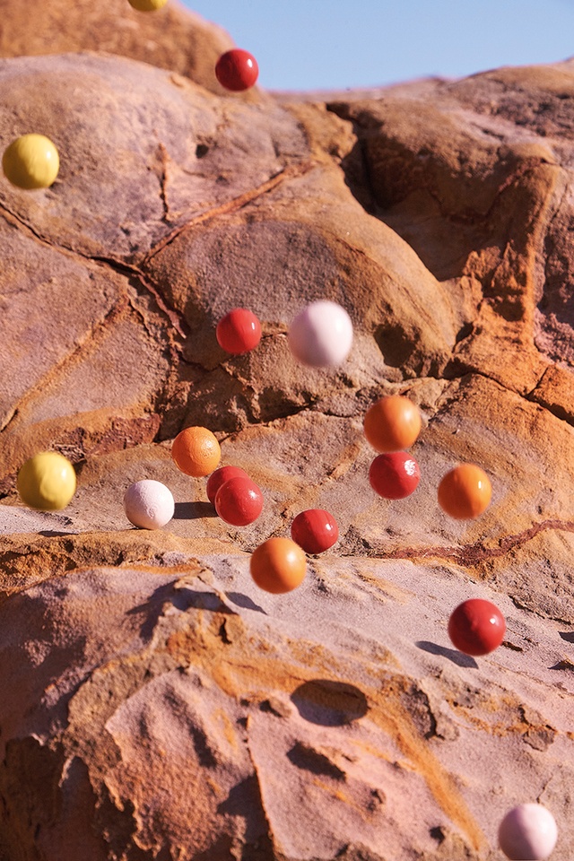
My father was from Mauritius. We went to Chamarel together: a geological formation in the Rivière Noire with sand dunes called the seven colours of the earth where weathered layers of basalt, iron oxides and aluminium hydroxides have settled. From red to brown and blue to violet, the particles naturally repel one another and are swirled by the rain. I visited the beautiful village of Valldemossa in Spain where Chopin wrote some of my favourite music — 24 preludes, including the ‘Raindrop Prelude Op.28, No.15.’ I associate every key in music with a colour — with this piece, for me, it is Resene Mahogany.
The beautiful stone that covered every street in Valldemossa was a blush tone. Walls were hand detailed, with small stones pressed into the blush-toned mortar punctuated by larger ones, creating beautiful artworks. The tones of the tiled flooring of the monastery where Chopin lived were coral, peach and blush. His music could be heard playing throughout the monastery — it was a complete sensory delight.
How did you arrive at your colour choices?
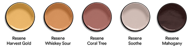
(CG): The colour collab was so much fun. Thomas [Cannings] and I wanted to create something that expressed a sensory moment in time, with movement: something that felt magical and otherworldly, rich in texture and colour saturated. The colours work together in harmony and counterpoint, with the backdrop of local rocks and shadows represented by Resene Mahogany and the balls (raindrops or molecules of earth pigment) in Resene Harvest Gold, Resene Whiskey Sour, Resene Coral Tree and Resene Soothe.
See more from the Resene Colour Collab series here.
ArchitectureNow works with a range of partners in the A&D supply sector to source appropriate content for the site. This article has been supported by Resene.