Q&A Arch MacDonnell
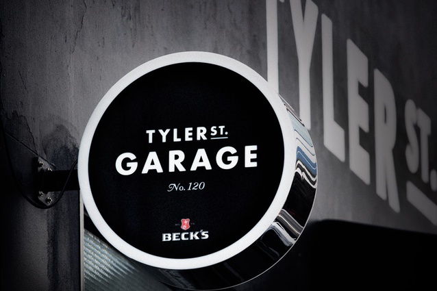
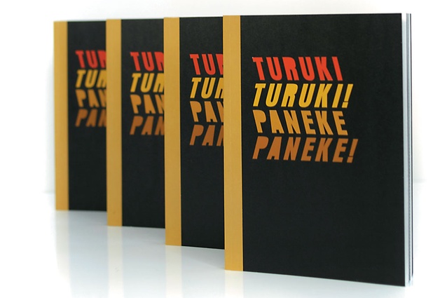
Signage for bar and bistro Tyler Street Garage in Britomart in Auckland.
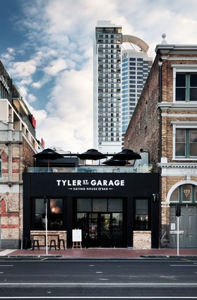
Signage for bar and bistro Tyler Street Garage in Britomart in Auckland.
A design for an Auckland Art Gallery exhibition about Maori art.
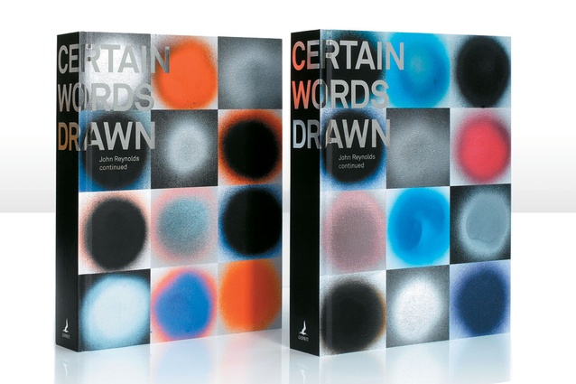
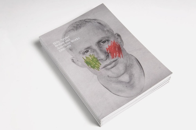
Certain Words Drawn, a book designed for artist John Reynolds.
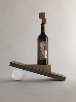
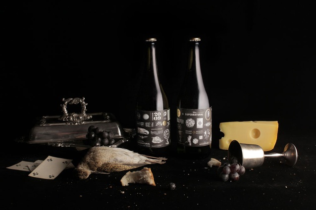
Label design for Dada Wines.
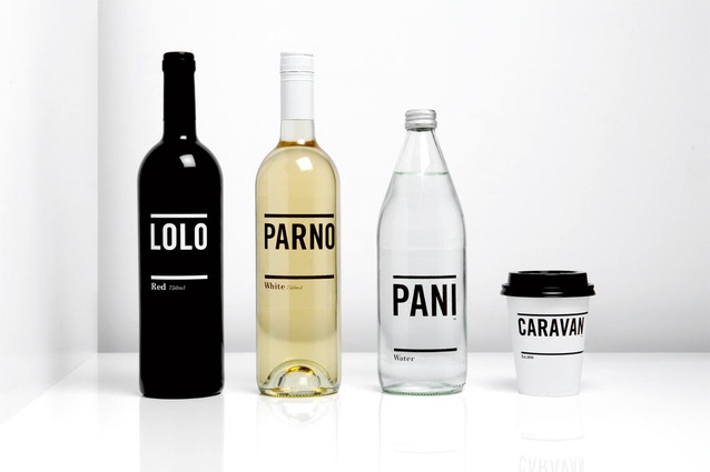
Beverage labelling designs for Caravan restaurant in London.
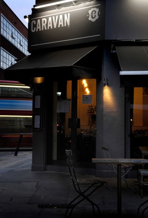
Signage for Caravan combines clean typography with a subtle flourish in the graphic stamp.
Book cover design.
Beverage labelling designs for winemaker &Co.
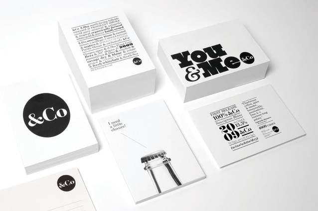
Stationery and branding work for winemaker &Co.

Beverage labelling designs for winemaker &Co.
Urbis: How would you describe what your firm does, and what you do?
Arch MacDonnell: Inhouse is a small graphic design studio that works on a diverse range of projects for both print and digital media. We strive to create designs that are true to the subject, whether this means a brand, an artist, an event, or a cause. It is also our job to ensure that those designs communicate effectively – that they capture the attention of the target audiences, create a sense of involvement and inspire the right kind of response. I’m the creative director of Inhouse and work in a pretty hands-on way with a talented group of young designers. I’ve also recently taken on a role as the design director at Shine, which is pretty exciting, as it presents a whole new range of opportunities to work with some of New Zealand’s largest brands as well as some great creative thinkers.
You do work for book covers, magazines, corporates, branding… Do you approach different types of jobs in different ways?
Not really. While the projects are diverse, my creative process remains reasonably consistent.
What made you go into graphic design?
As a kid I used to head into my father’s work (Colenso) in the weekends and be in awe of the marker selection in the art department. The fact that I could go crazy and use them to my heart’s content was pretty cool. Many project title pages and posters were created there, and when I think back on them they were often largely typographic solutions accompanied by rather miniature illustration. Art was certainly my thing at school; I loved it and loved applying it to school projects. Being exposed to the advertising world at such a young age and seeing that there were actually jobs out there for people who could draw, I guess I always knew I would head in that direction.
What makes a design work for you?
That’s a really hard question to answer as there are so many factors that make design work. Increasingly, I’m drawn to work that has a degree of purity or simplicity. Work where you don’t really feel the designers’ hand; work that has gone through a reductive process to get to the essence of the message or idea and is free of superfluous material. It’s no easy task to achieve this in practice. There’s a great quote from Paul Rand that rings true: “Design is so simple, that’s why it’s so complicated.”
What are some of the projects that you are most pleased with?
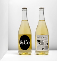
I always find looking back on past projects a bit fraught to be honest. I tend to find fault, and with the benefit of hindsight there are always things I’d like to have done just a little bit differently. I guess that’s what keeps me always striving to do the next job that little bit better, taking the lessons learnt from the last project into the next. That said, there are a few projects that are dear to me. I’m proud of Certain Words Drawn, a book designed for and with artist John Reynolds. This book was just so much fun to make. It took the best part of a year. We wrote our own brief and made something in a collaborative way that was immensely satisfying. It was a 1 + 1 = 3 experience. Dada 1 and 2, the wine labels designed with long-time collaborator Fred l’Ami, still feel pretty special and the identity work for restaurant Caravan and winemaker &Co are projects that I’m pleased with. Both used only a black and white palette, and this self-imposed restriction forced the typography to work that little bit harder.
Do you sketch or do you work straight onto the computer. How does the analogue work with the digital in your practice?
A bit of a combo to be honest. I generally sketch at the beginning of a project. I’m a fan of the graphpaper Moleskin and have a few on the go at any given time. Sometimes I find myself going straight to the computer, particularly with editorial- or type-based projects, but these early explorations are really just digital sketches and are always proceeded with thought away from the computer. I do a lot of my creative thinking away from the studio. I find the isolation of running and mountain bike riding a great place for this.
Why is good design important?
It’s hard to answer this question without sounding a bit like a motivational speaker. “Believe it people… graphic design can change the world!” When it’s working well, design can inspire and motivate, it can encourage people to buy, try, make or do things – things that they didn’t necessarily think they would, should or could. Having the ability to improve or influence another person’s life, whether in a profound or relatively unnoticed way, is pretty significant I guess.
What are you working on at the moment?
A couple of magazine titles, a book that celebrates the new Auckland Art Gallery, another that celebrates the Athfield house in Khandallah, a company rebrand, a top-shelf Waiheke syrah, as well as some projects with Shine, one which involves great local artists, cool Auckland bands, Beck’s beer and a rainbow monkey. What’s not to like?